Case Study
Design Your Own Wedding :
~
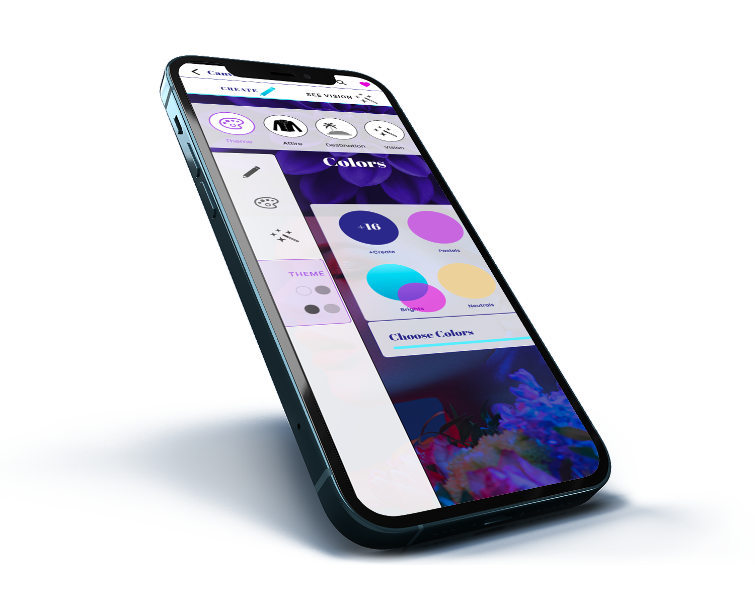
Abstract: The purpose of this project is to marry the best combination of wedding apps in the current market, and to make something truly unique. Out in the market today, there are many apps for planning your wedding. I wanted to create a bit of a twist on this idea, and instead allow a user to let their imagination flow with an app to ‘Design Your Own Wedding’. It can be real, or it can be make-believe.
Problem Statement:
Most wedding apps are built with a customer in mind who is planning a real, live wedding. This limits the user’s creativity by causing them to jump into reality before they may be ready.
Solutions & Goals:
Our new and unique app would allow users to be creative and let their imagination flow, without the added pressure of real dates, websites and registries. Instead, a user can play make-believe and imagine their ideal wedding while letting their creativity flow without pressure.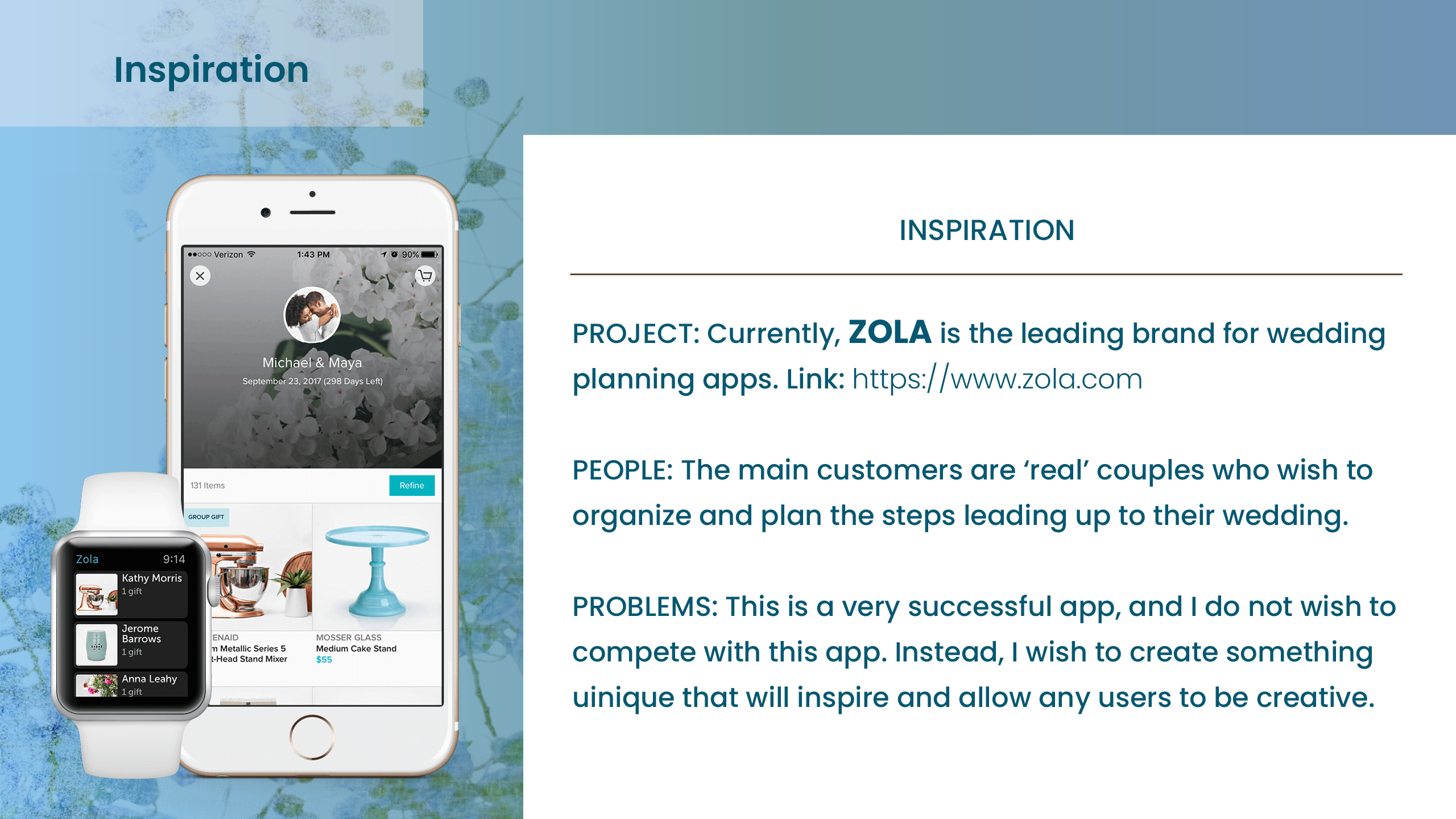
Competitive
Research
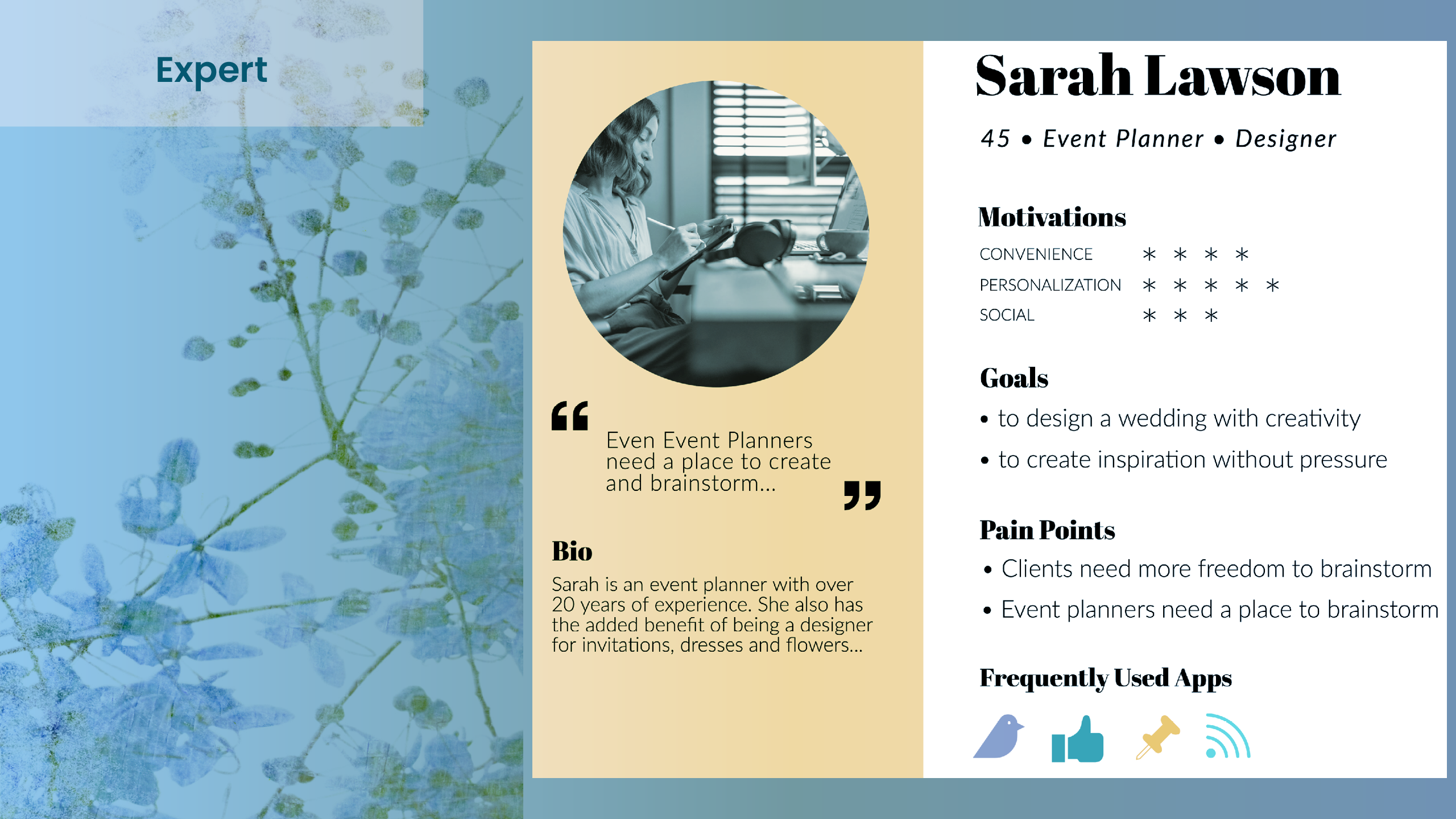
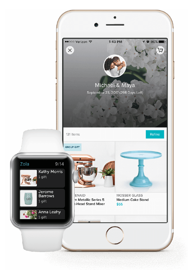
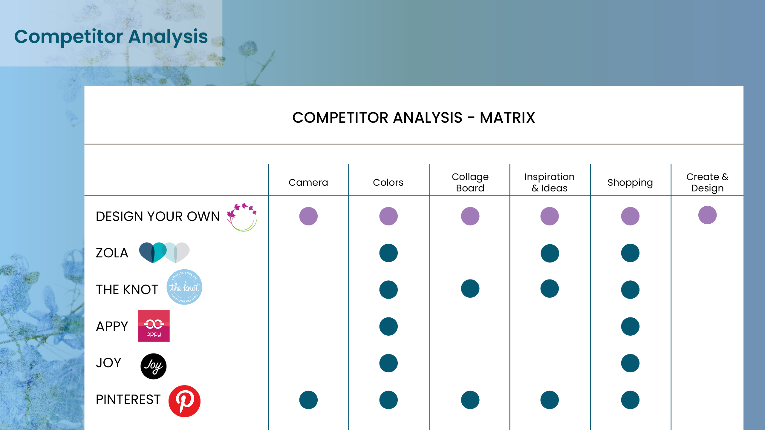
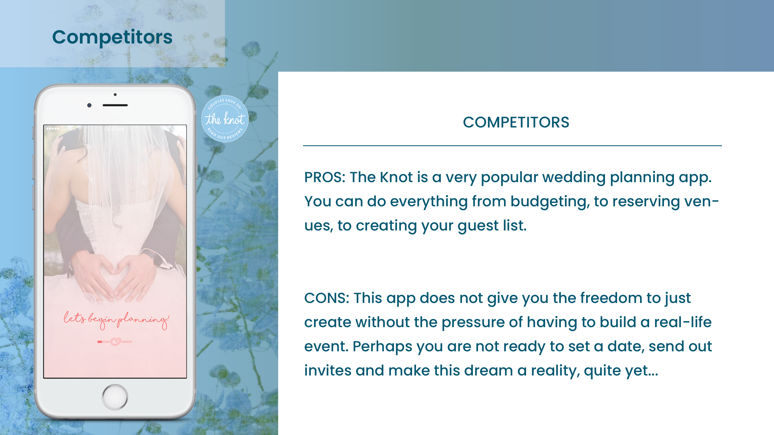
I also took a look at the current competition in the field for wedding apps, taking into consideration their advantages, disadvantages and completing a feature matrix to pull all of the research together with helpful next steps.
02. Competitive Research
~
Competitive Research is essential, in order to fully understand the current market. This helps us to know what is working, not working and where improvements can be made.
Persona Research
& Target Audience
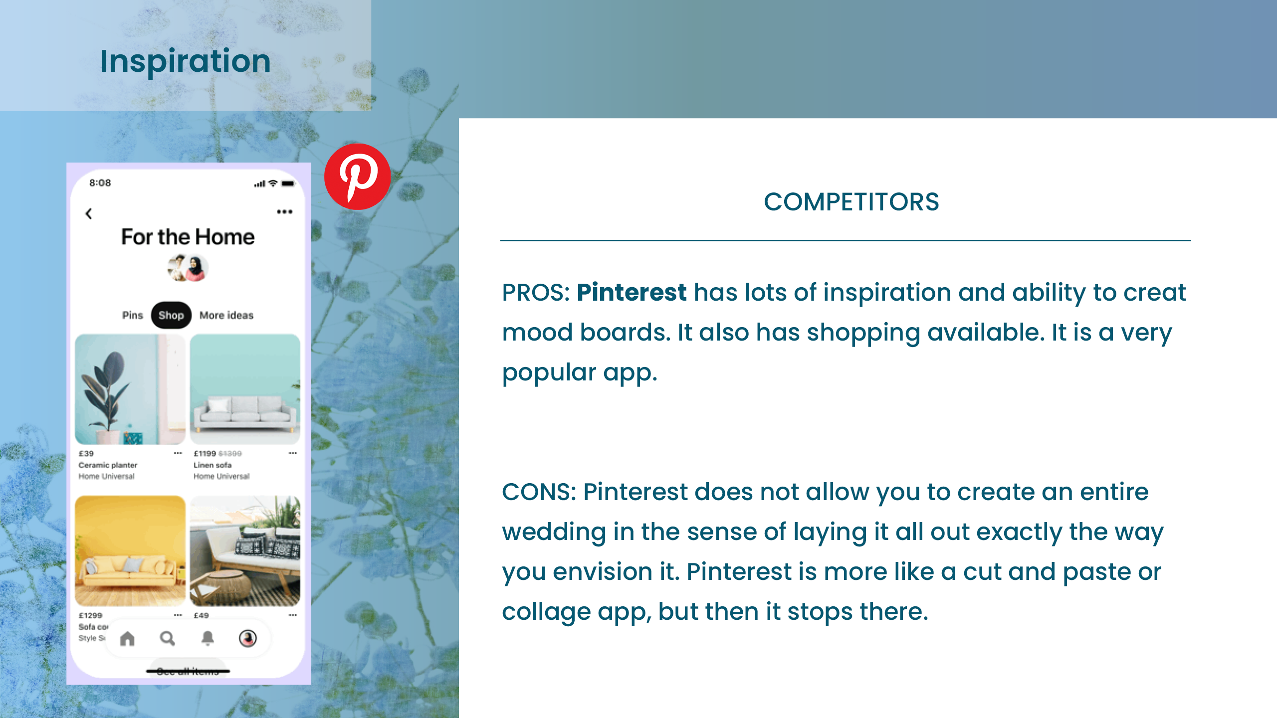
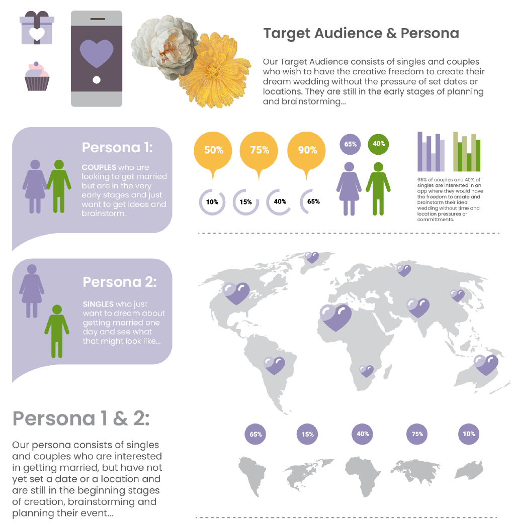
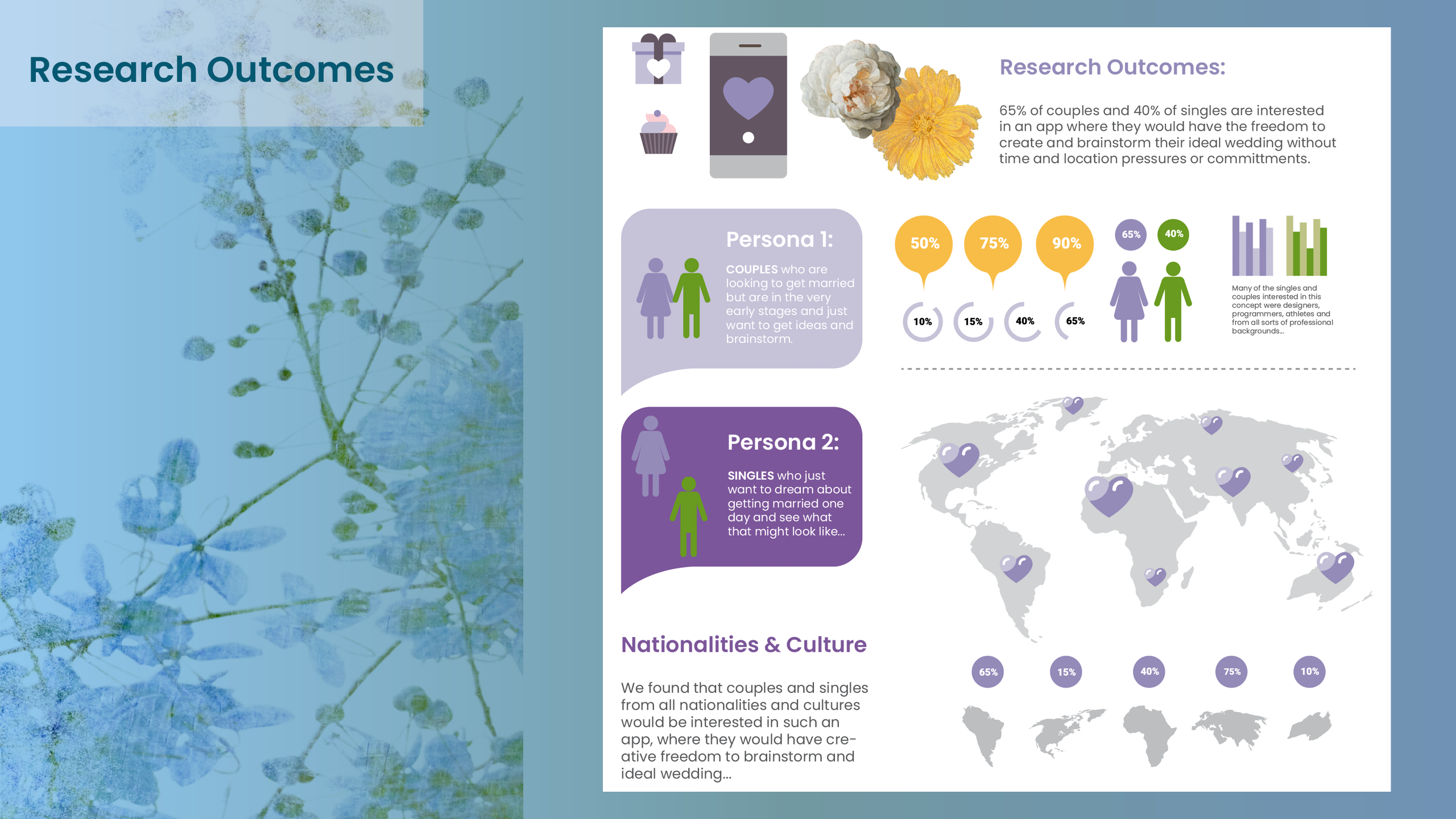
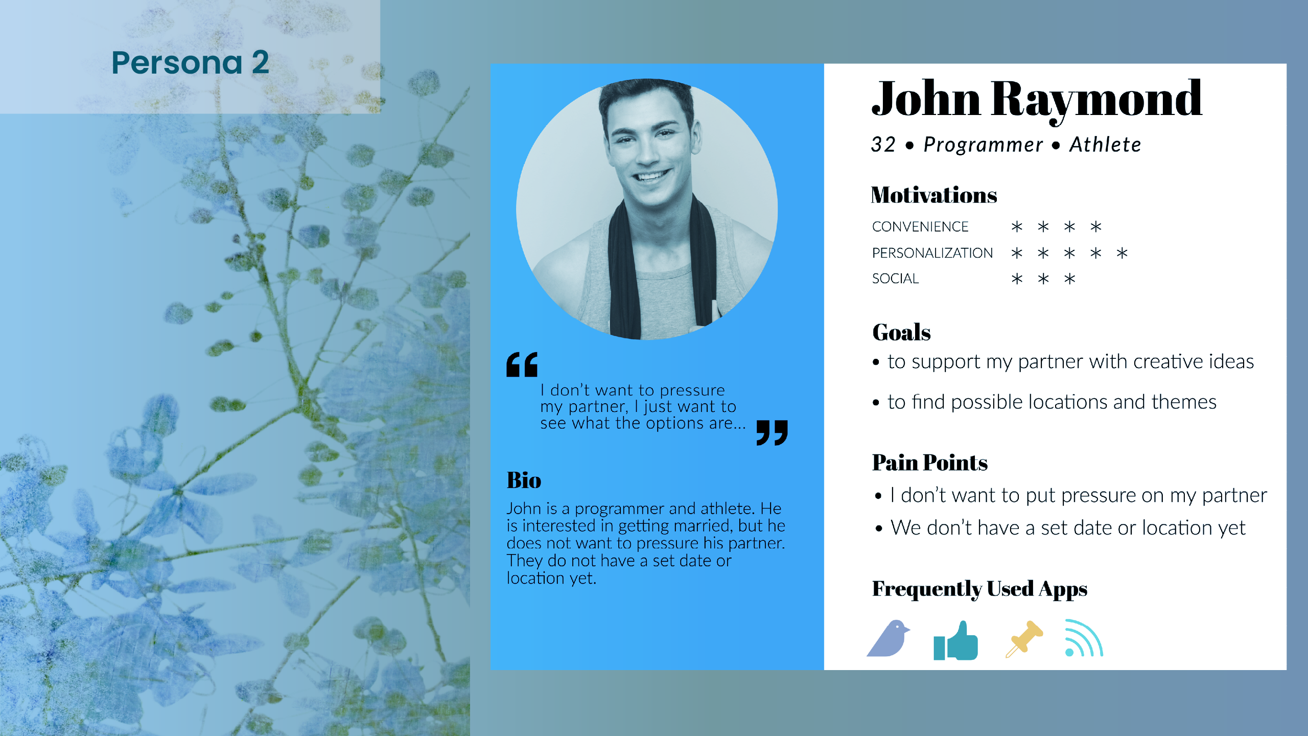
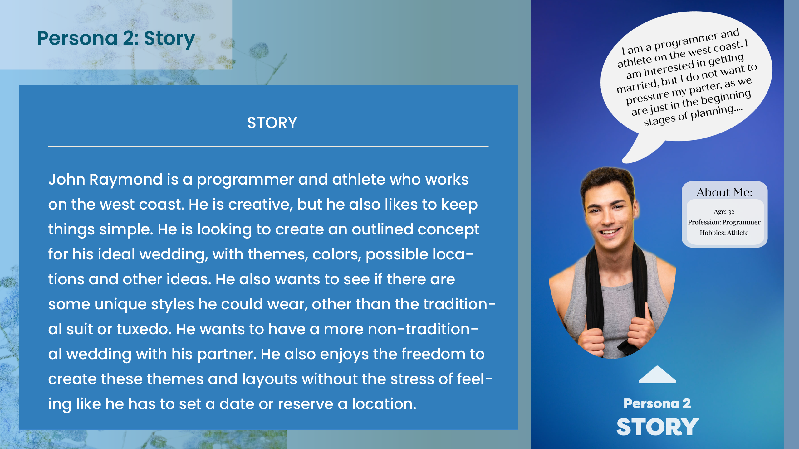
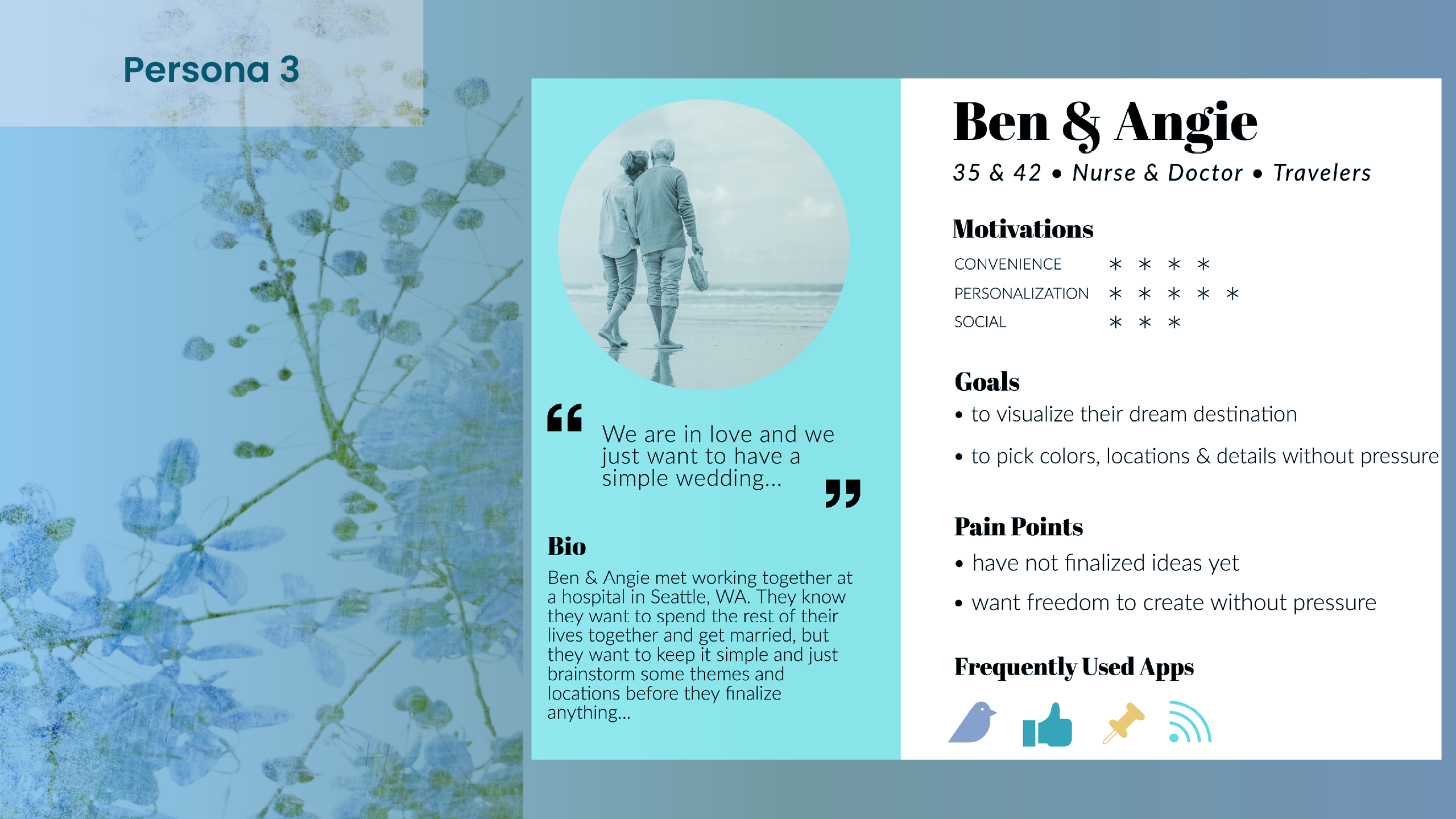
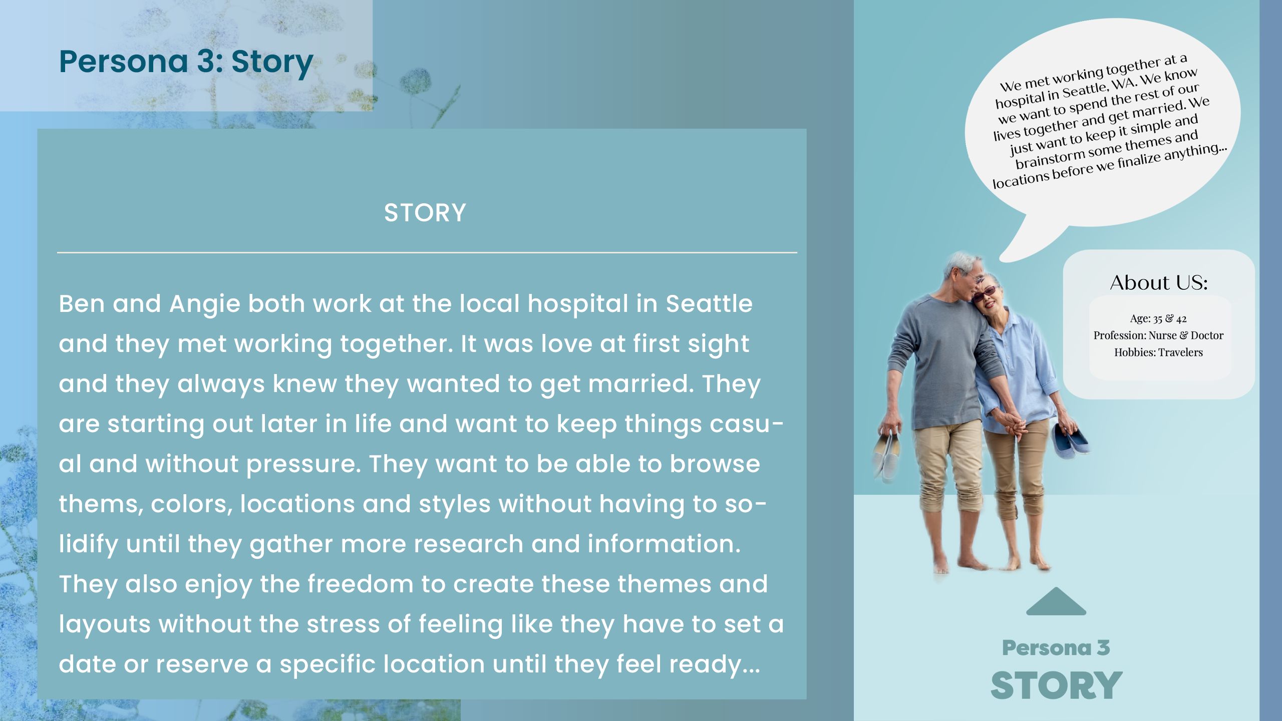
There are 3 main persona for this UX Design Case Study. One is a designer, another is a busy male athlete & professional, and a third is an older couple that loves to travel.
03. Persona Research
~
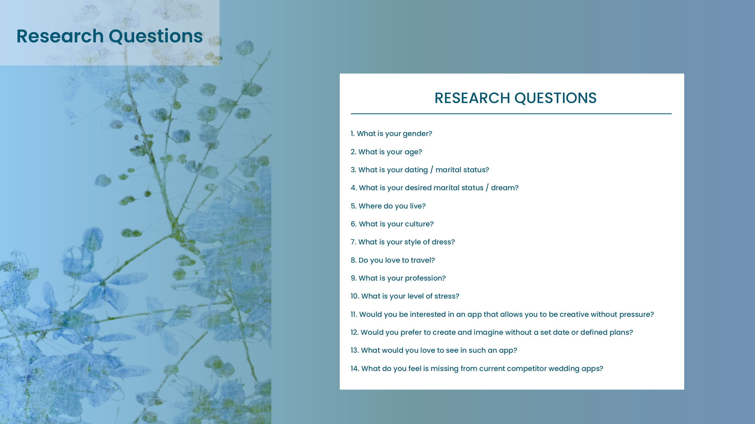
In order to have a more realistic and deeper perspective of a potential user, we create user research. A persona is an archetypical user who has the goals and characteristics similar to a larger group of users. We look at behaviors, patterns, attitudes, skills and backrounds of the users. We also place them into an environment specific to their lifestyle and needs.
User
Persona
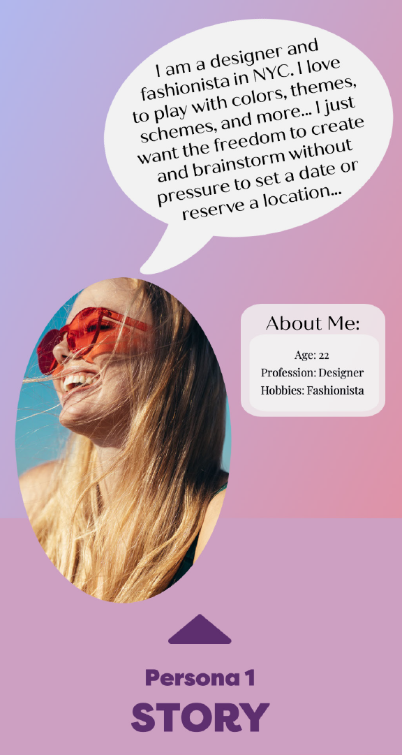
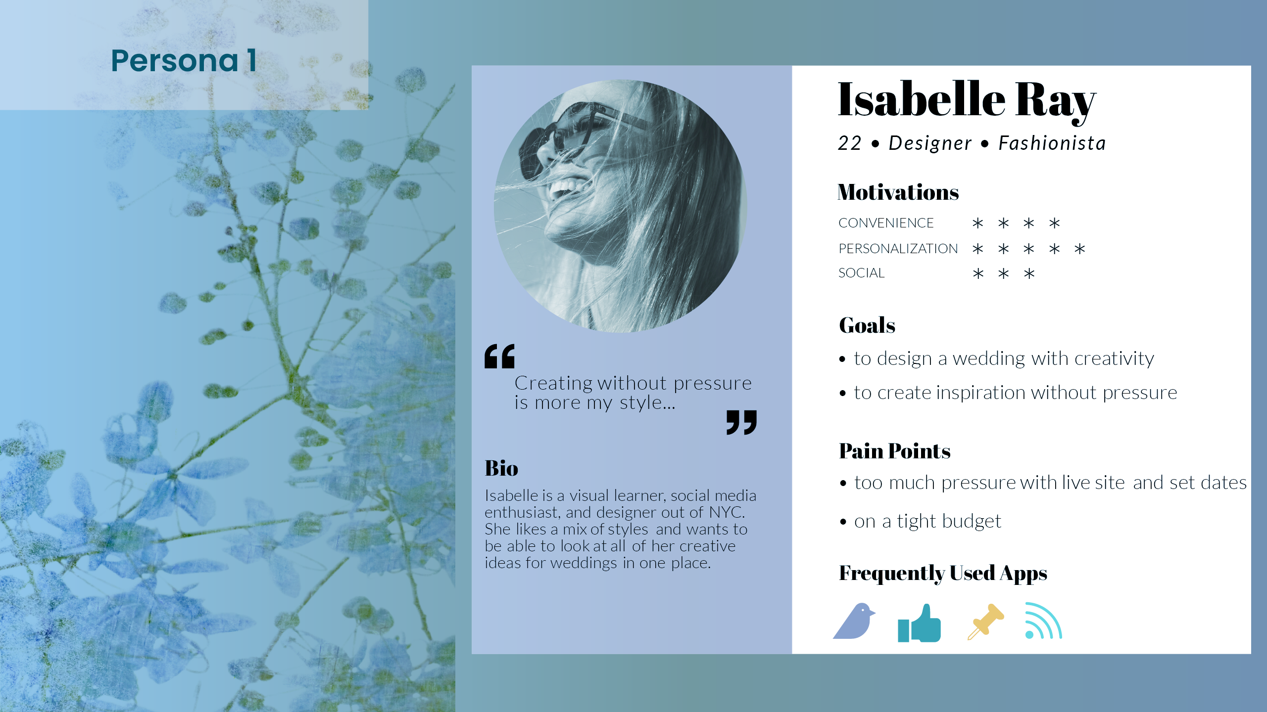
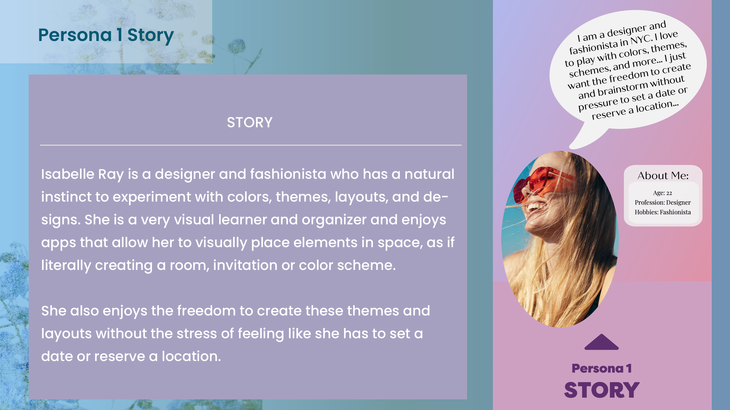
It was essential to create the user persona, in order to get a better understanding of potential needs, goals and objectives for this Wedding App and UX Design process.
04. User Persona
~
In order to have a more realistic and deeper perspective of a potential user, we create user research. A persona is an archetypical user who has the goals and characteristics similar to a larger group of users. We look at behaviors, patterns, attitudes, skills and backrounds of the users. We also place them into an environment specific to their lifestyle and needs.
Ideate
User Flow
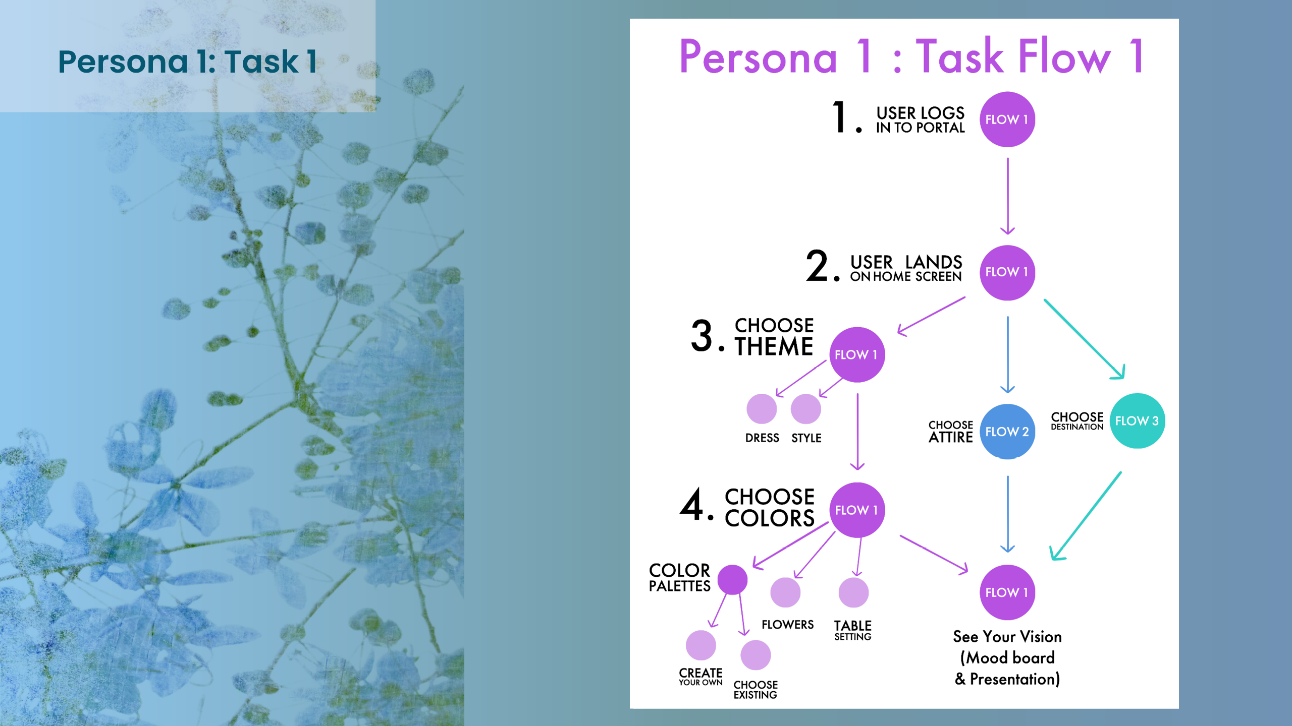
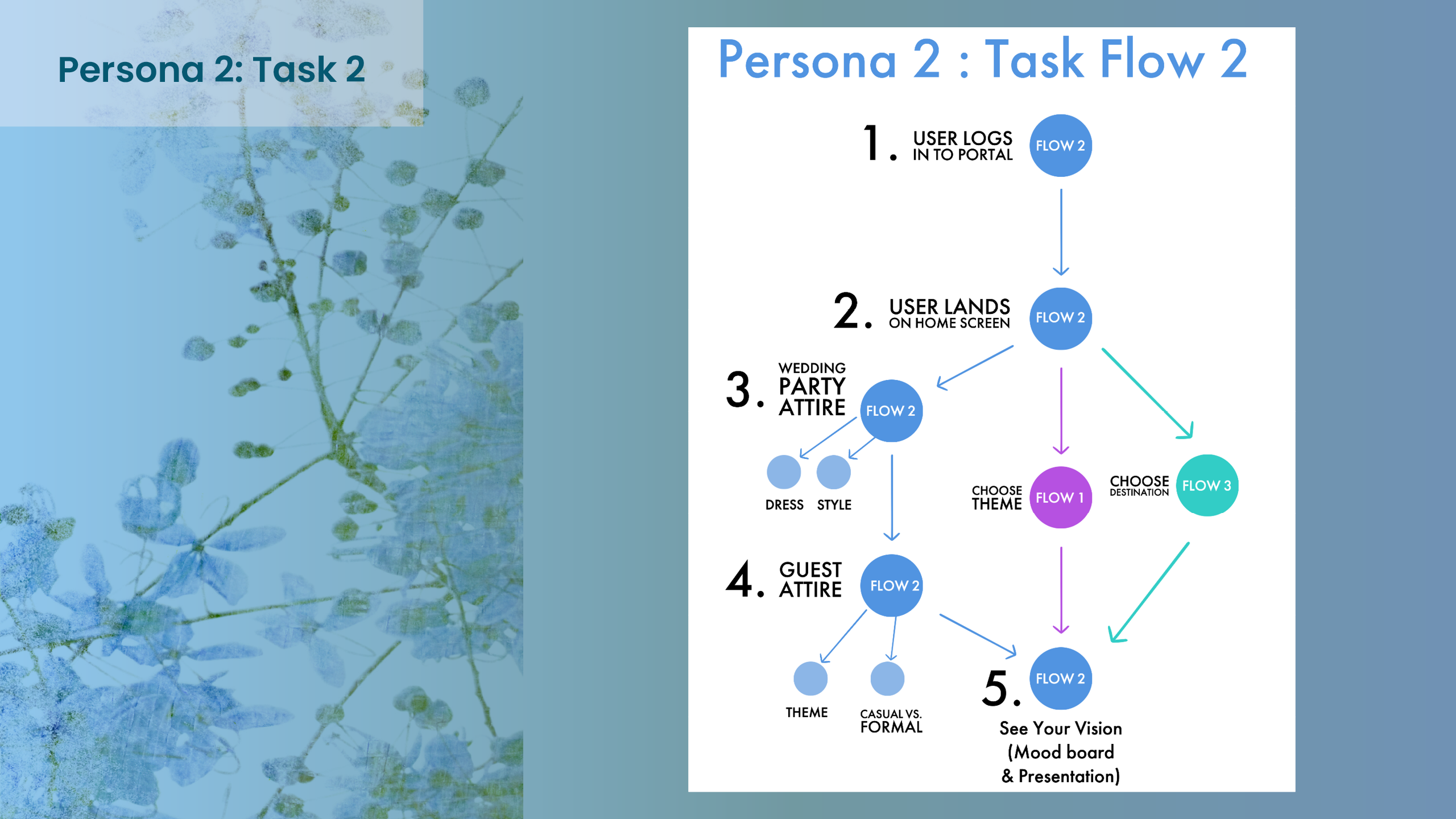
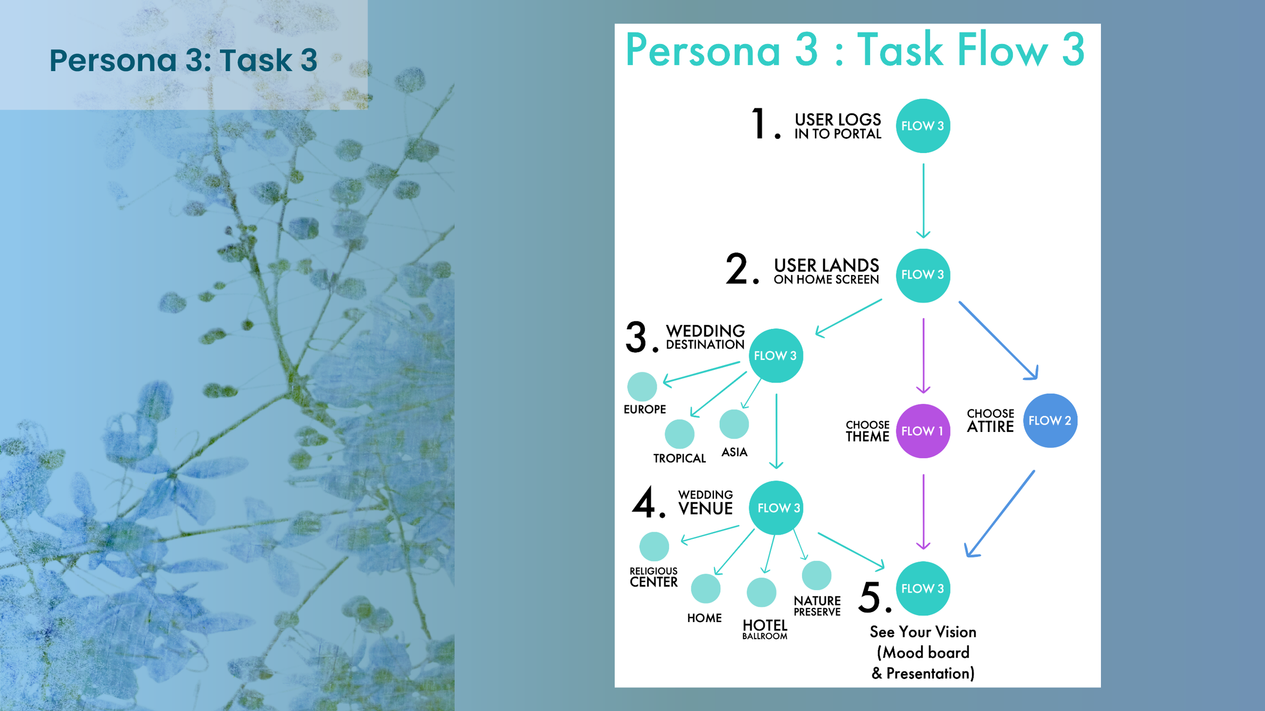
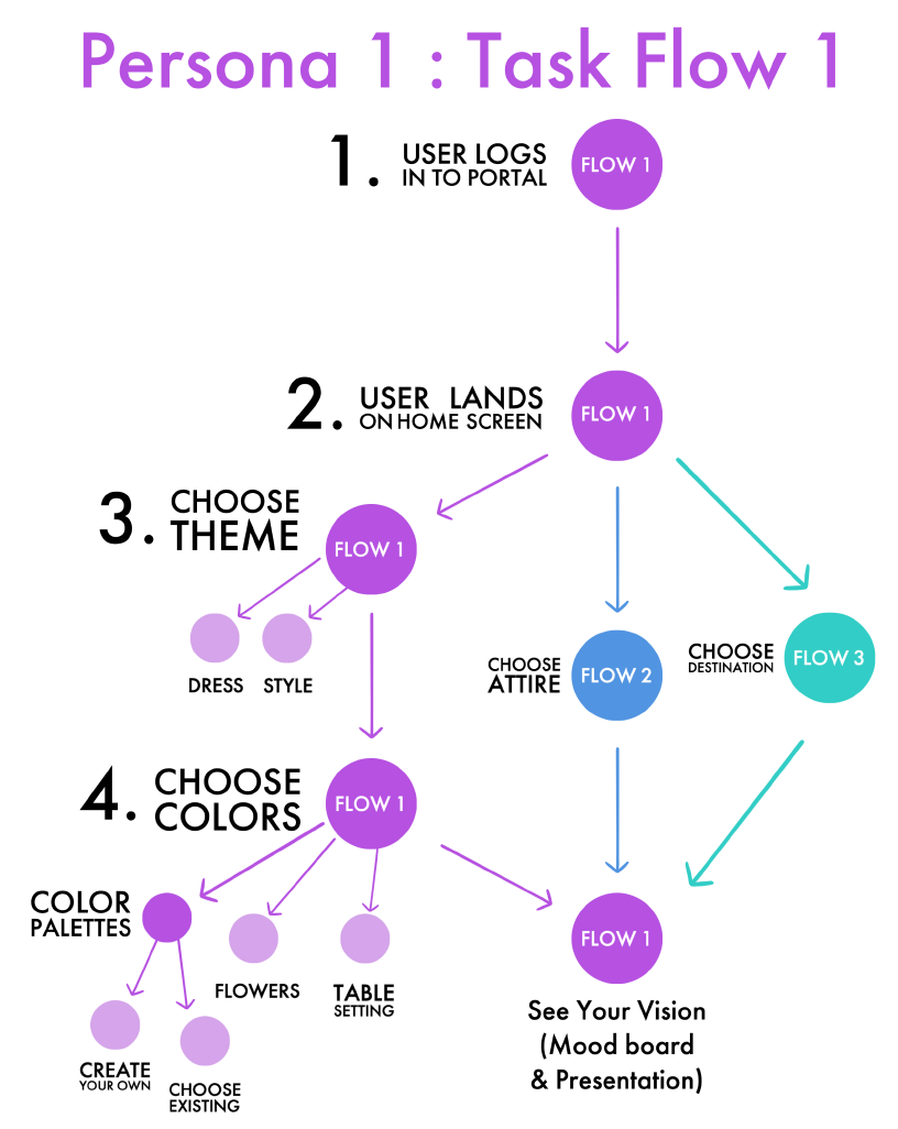
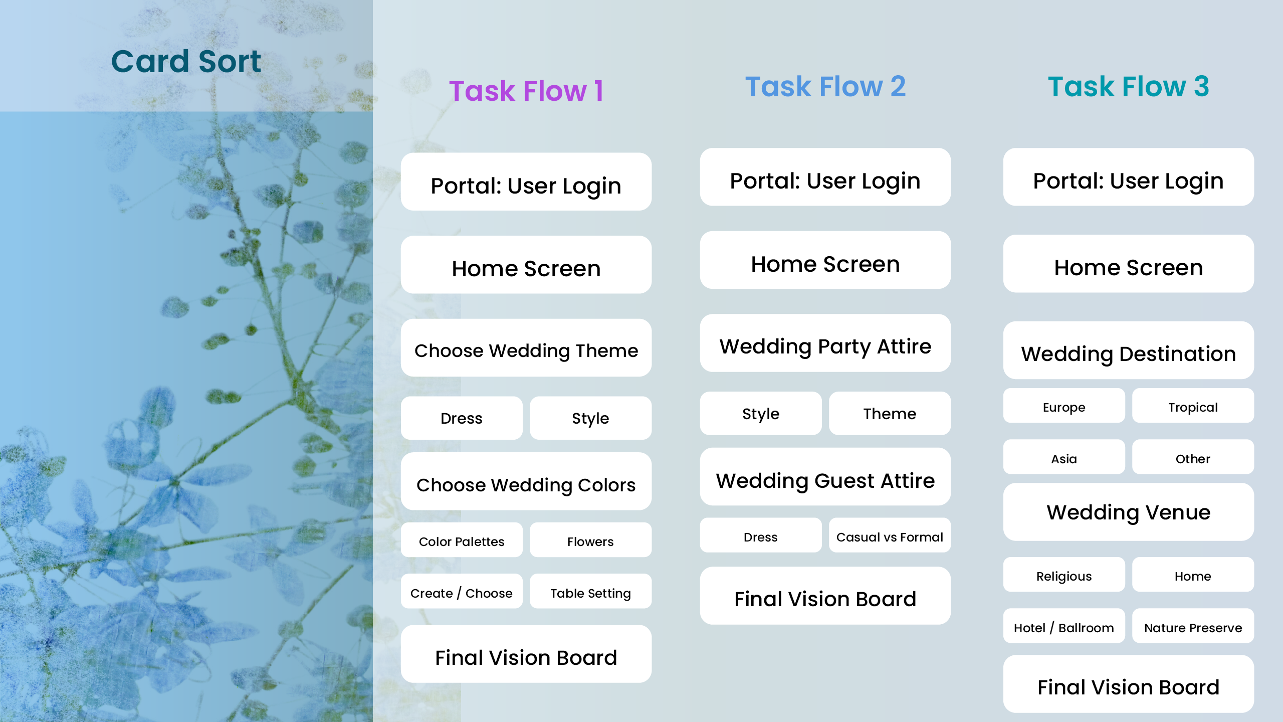
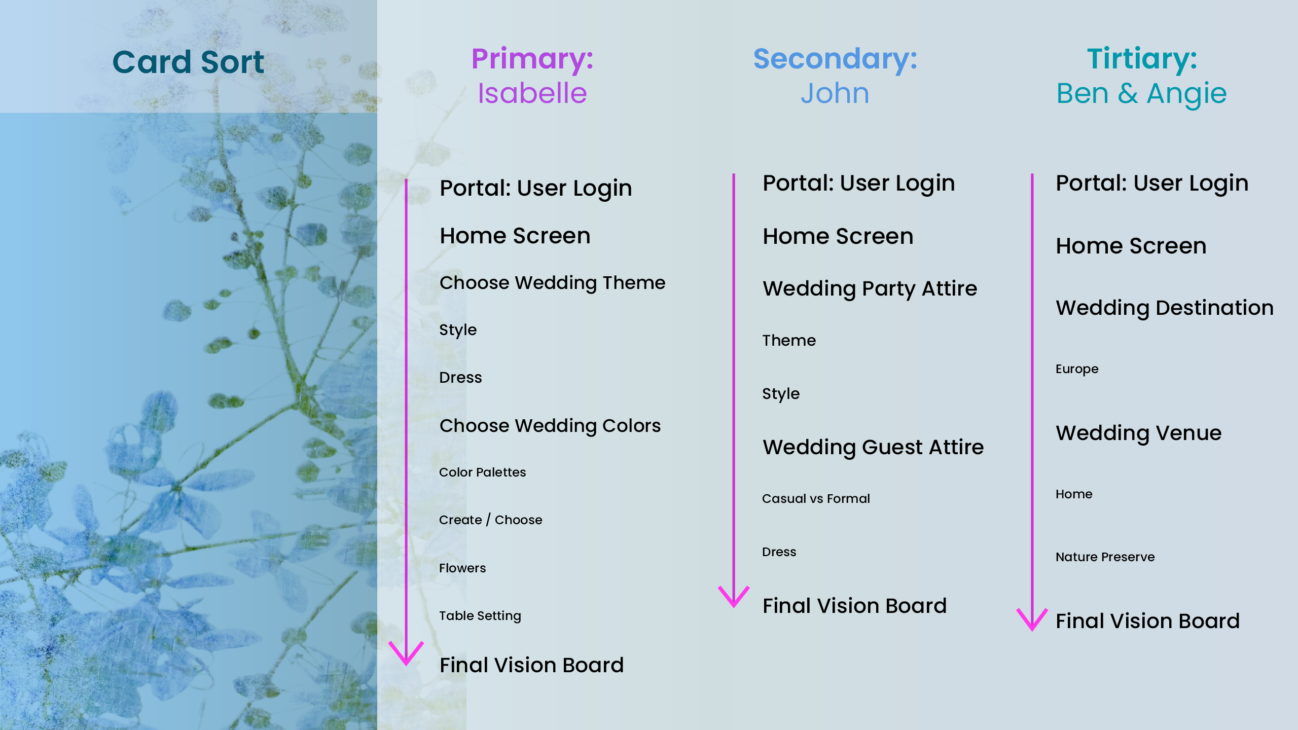
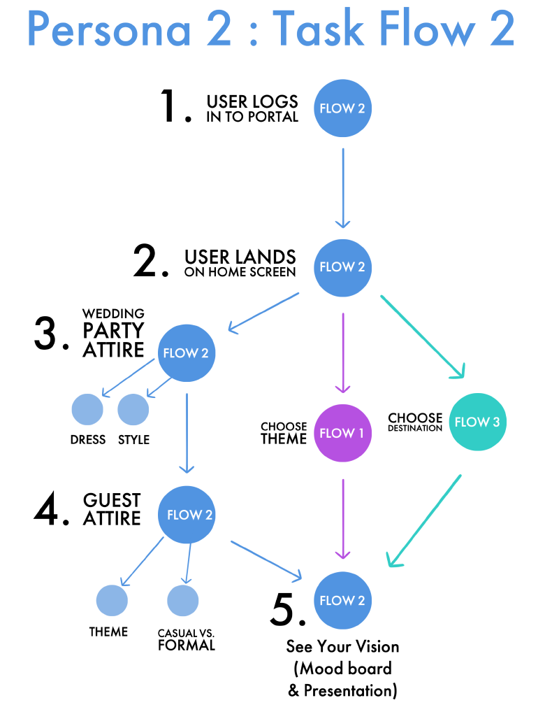
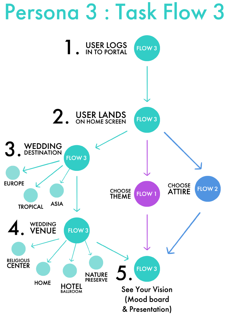
Next, I began to asses how the user flow might look and feel for a potential user and persona, taking into consideration their needs and backgrounds.
05. Ideate User Flow
~
The User Flow is an essential aspect of great UX Design and research. The journey through a digital experience should feel intuitive, natural and logical. This is why it is important to really grasp the User's goal for an app and where they are hoping to reach in their goals and experience. The Task Flow allows us to map this out, almost in the same manner that an architect would map out a user's journey through an airport, with logical flow, direciton and purpose.
Ideate
Story Boards
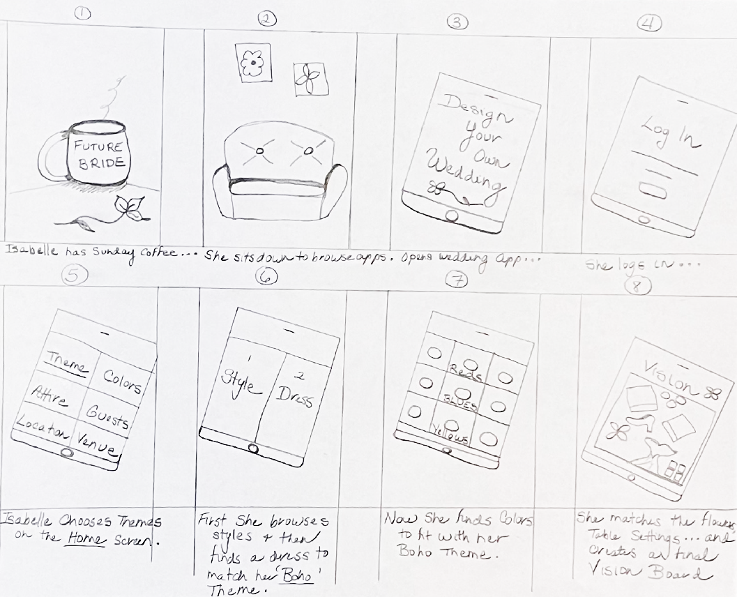
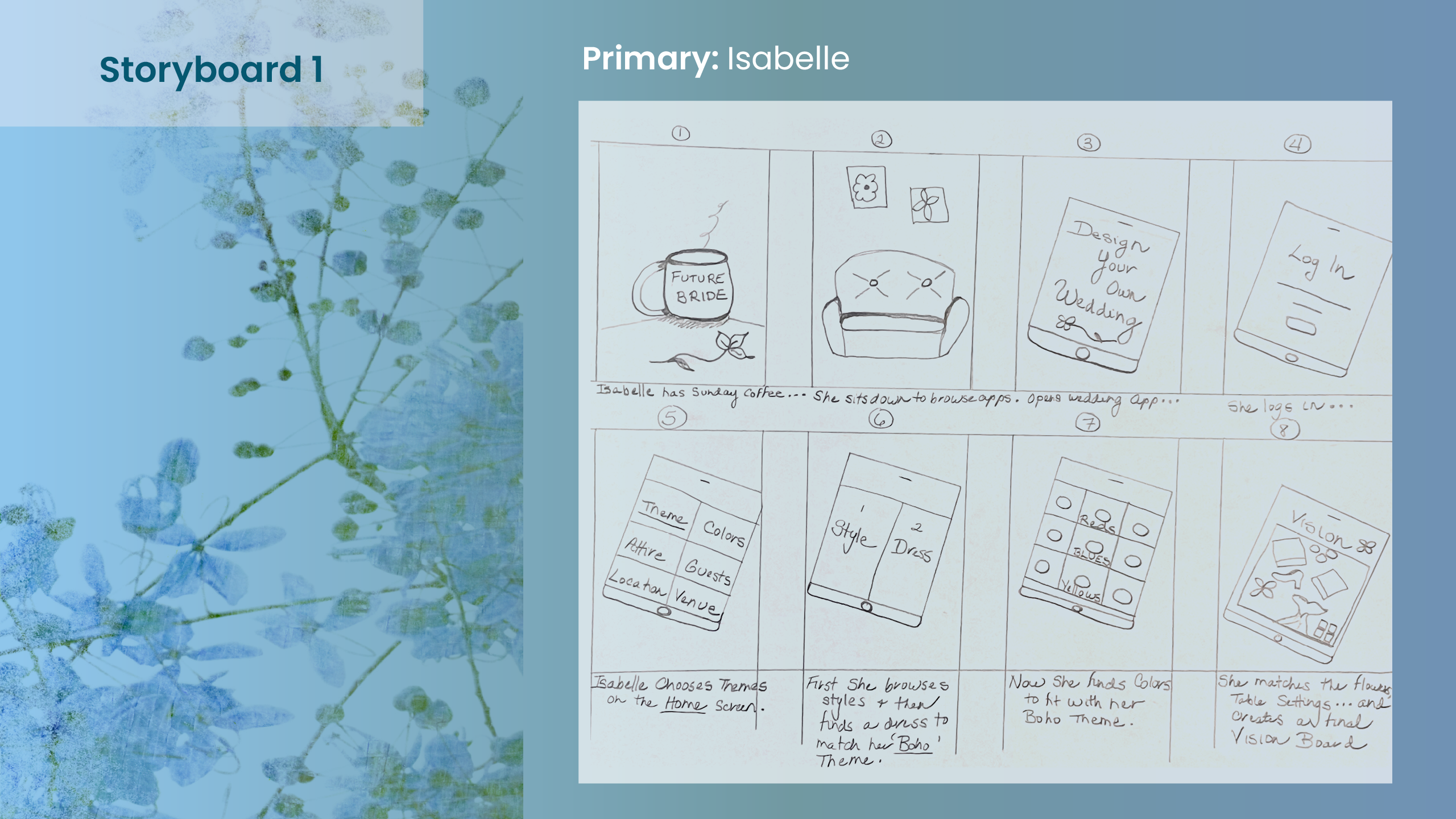
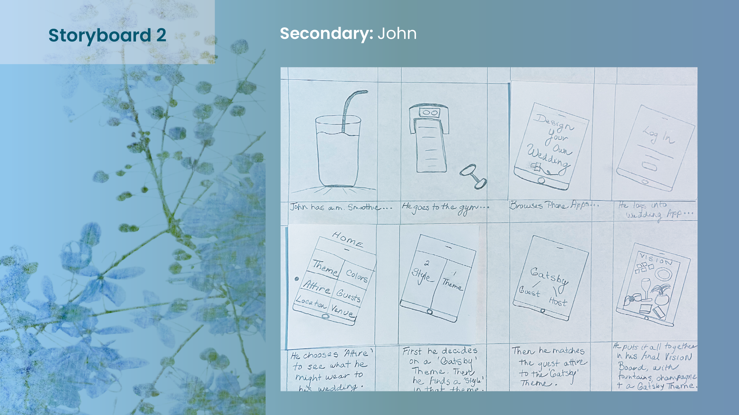
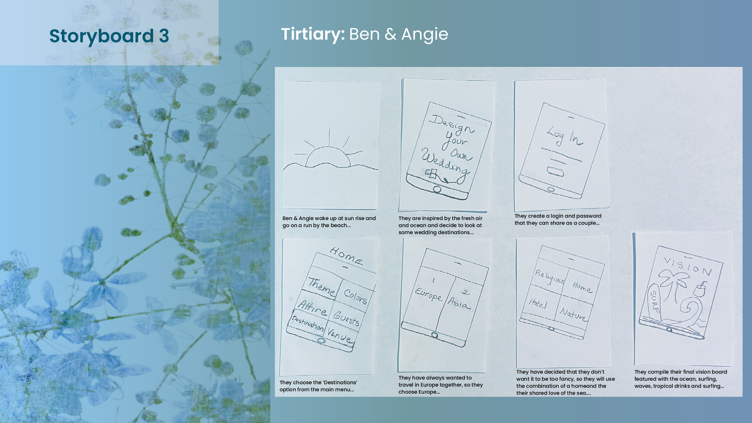
Next, storyboards were created to begin to get a sense of inital designs and concepts, taking into consideration the user needs, goals and backgrounds.
06. Storyboards
~
Storyboards are a very useful tool to help us begin to visualize some of our initial design concepts, user flows, and goals.
Ideate
Wireframes
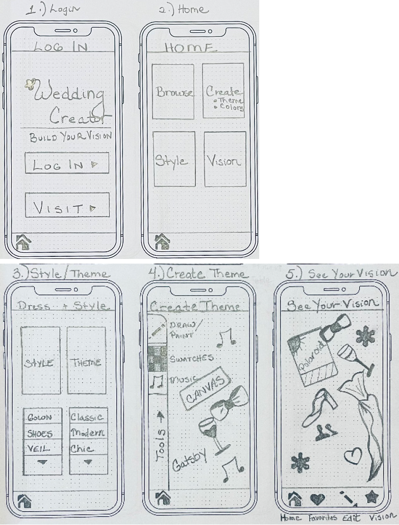
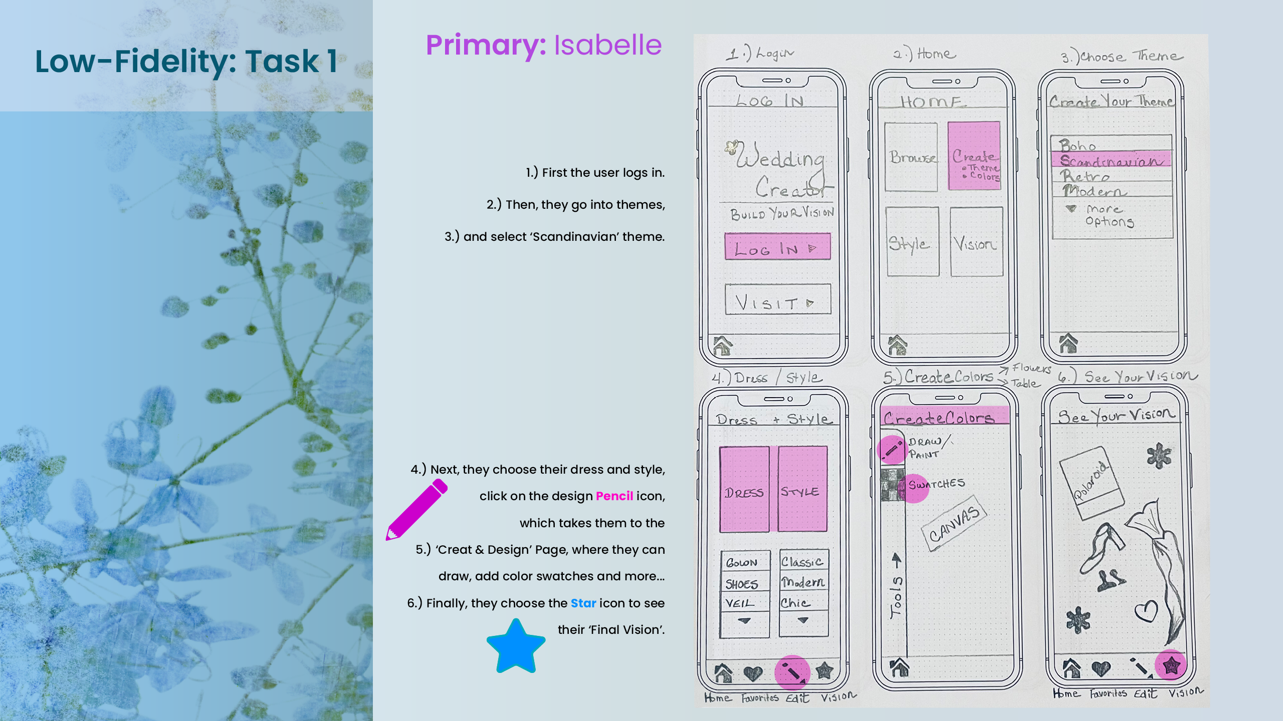
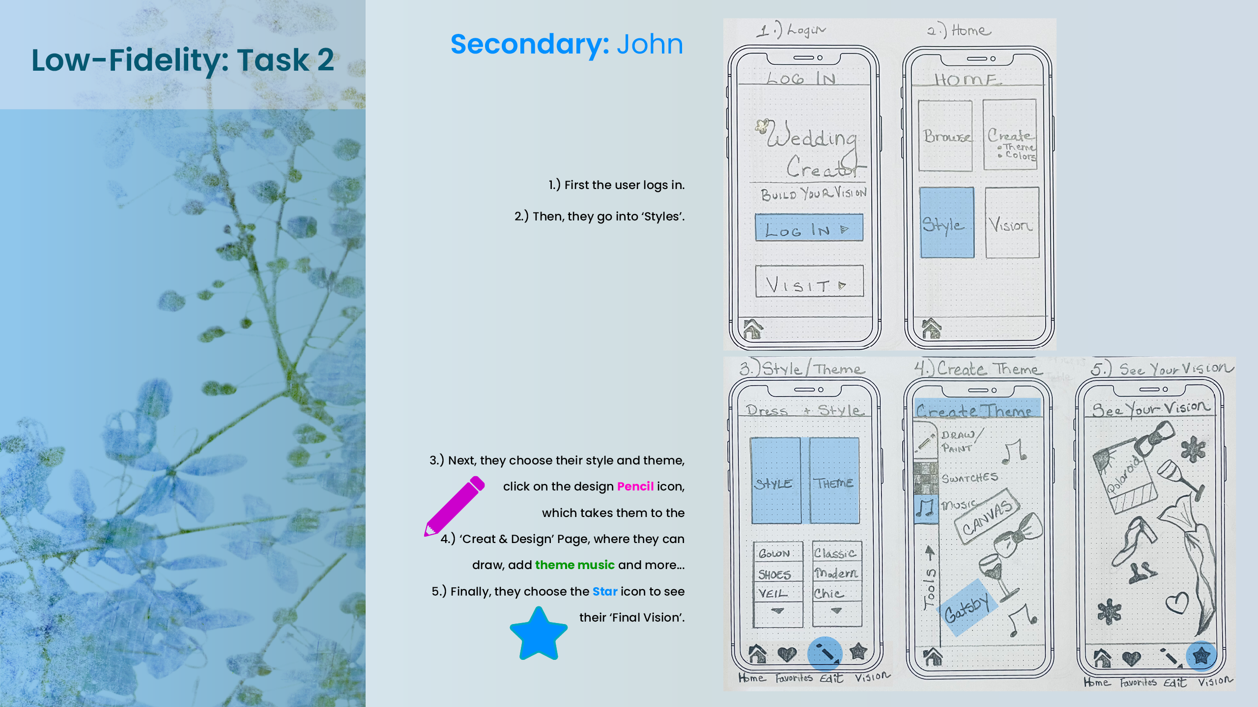
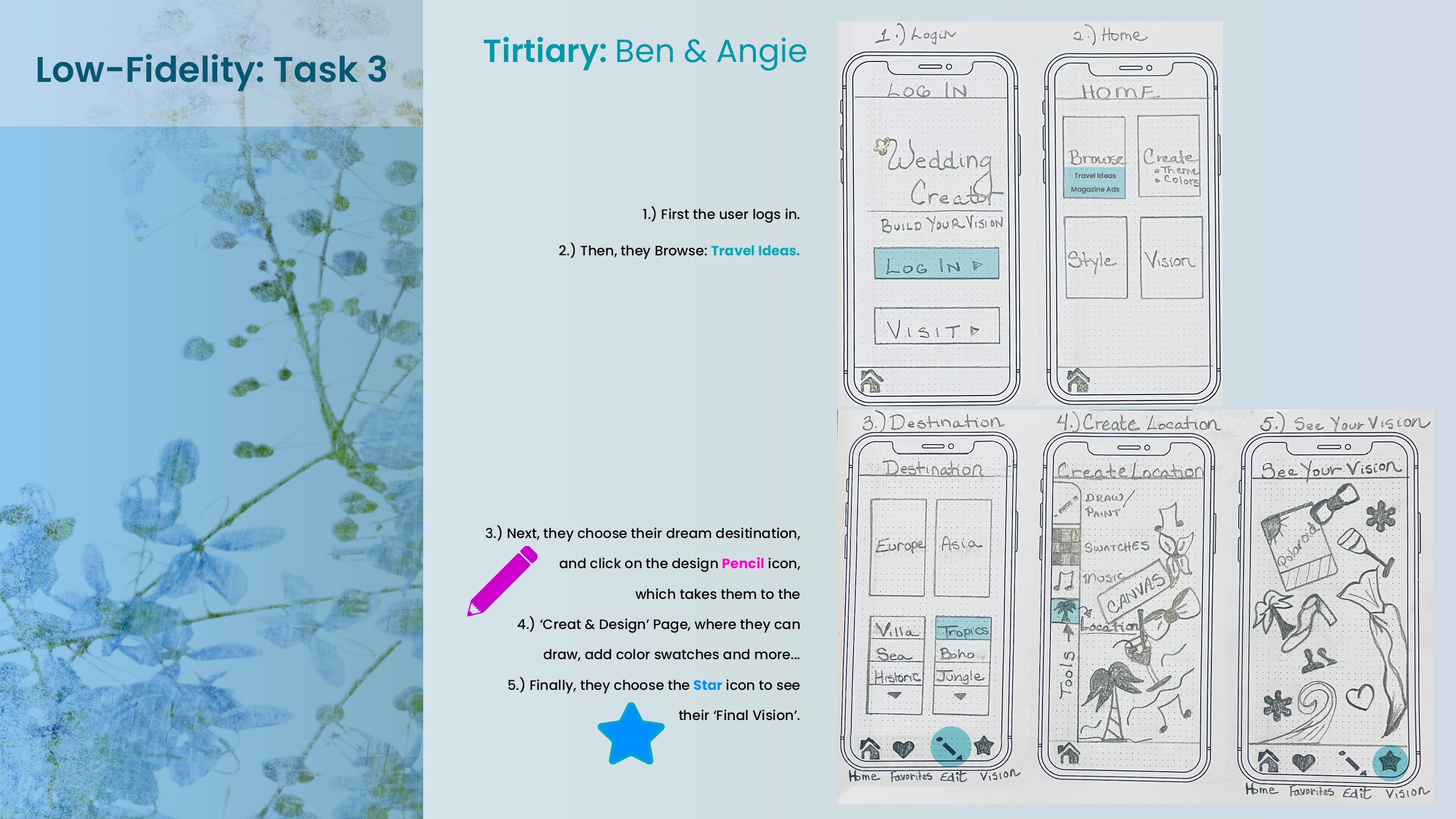
Wireframes were an essential next step in order to assess any potential design flaws, concerns and hilights, as well as to ensure that the user's needs are met and that the navigation is clear and concise.
07. Low Fidelity Wireframes
~
Wireframes help us to layout the grid system, alignment, initial designs, initial usability concepts, navigation and overall user flow.
Proof
of Concept
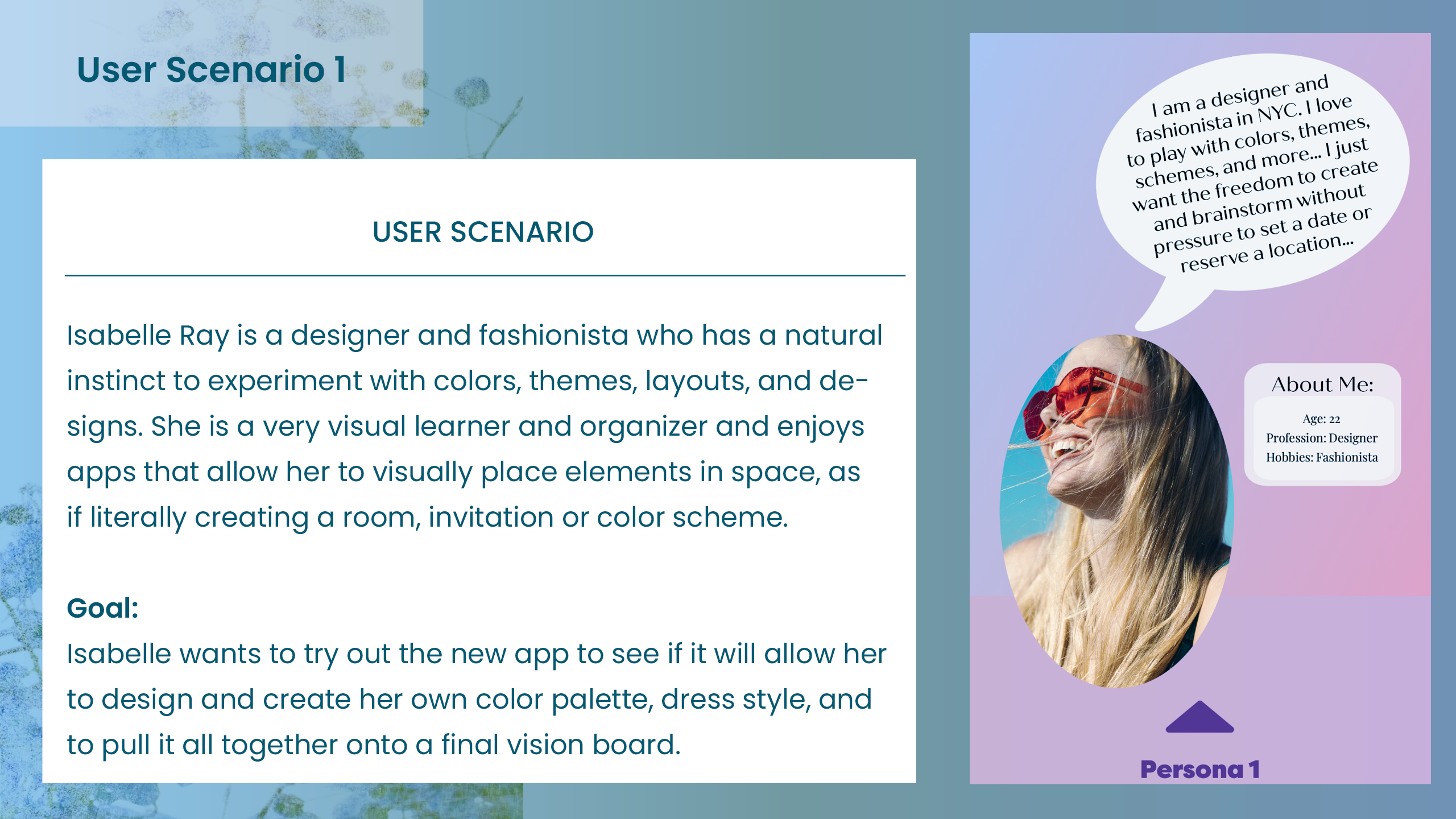
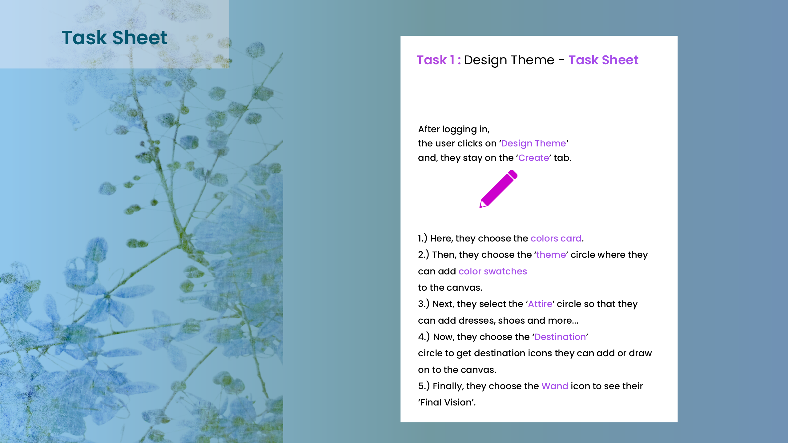
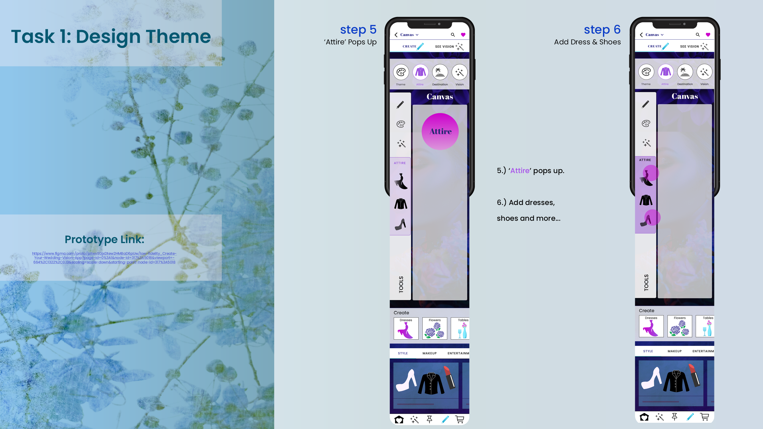
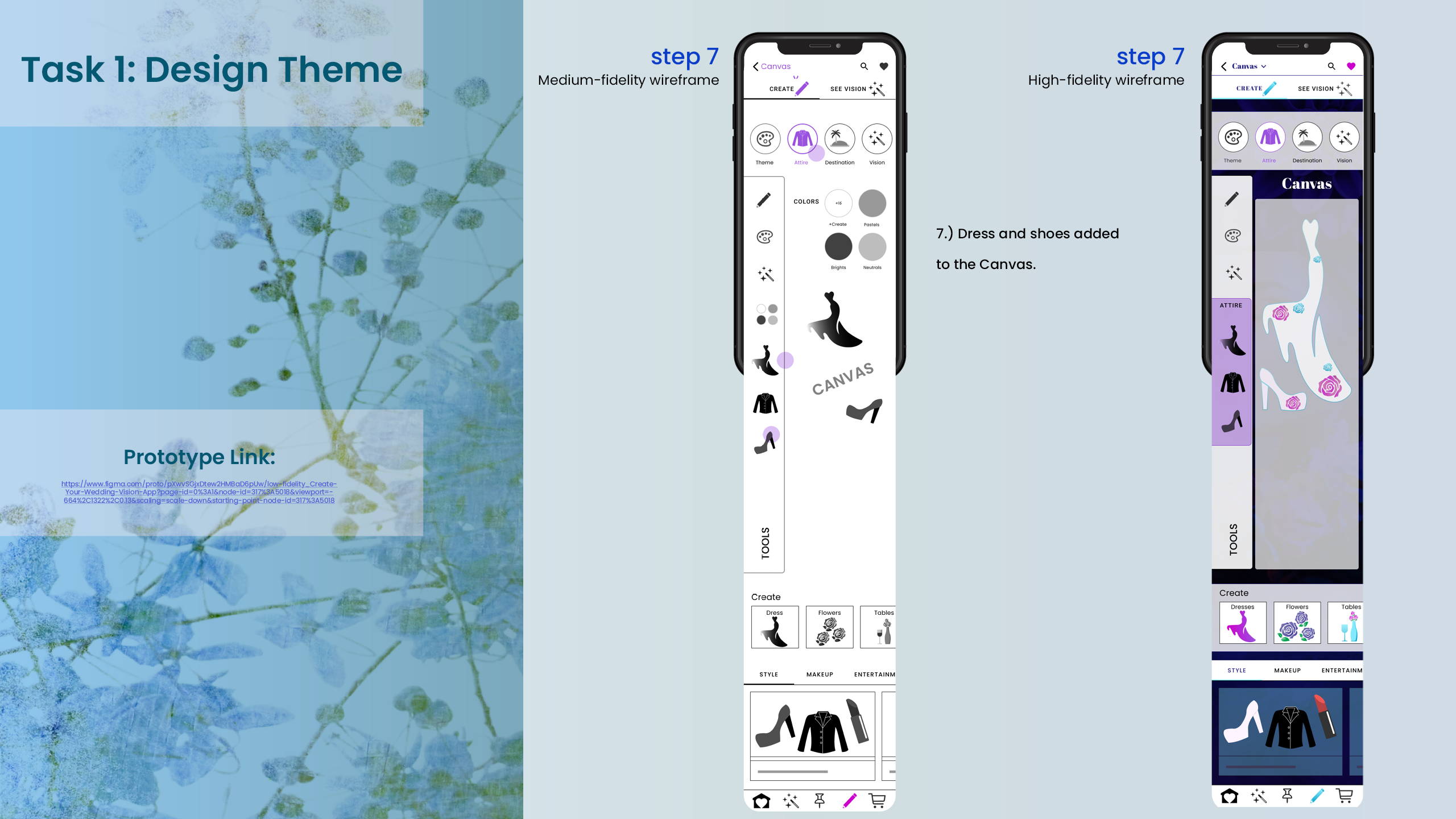
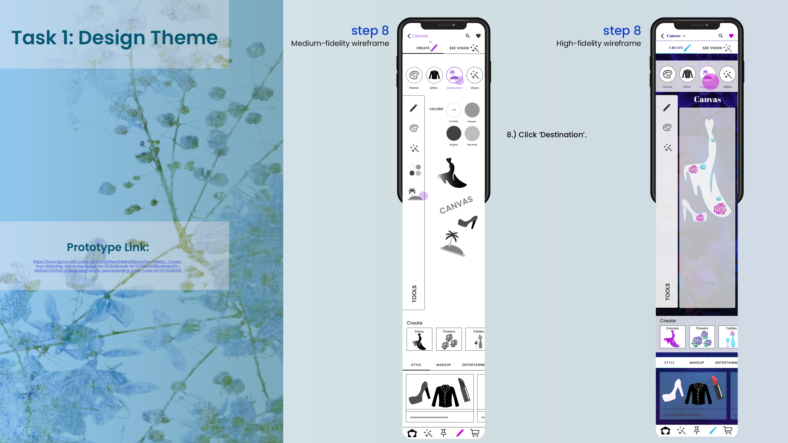
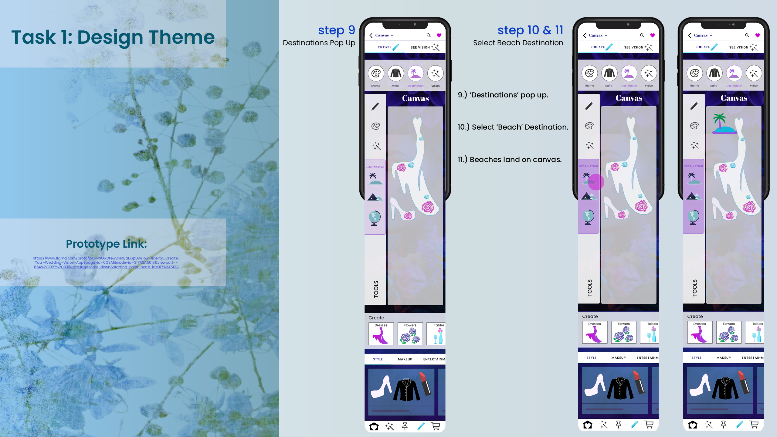
Now, inital concepts are put to the test to see how they will function and work. We create User Scenarios and Task Sheets to guide us through the screens that will need to be created in medium and then high fidelity wireframes.
08. User Scenario 1
~
Once the low fidelity wireframes were complete, I was ready to begin testing the userflows and main functionality on the users. We received some helpful feedback for improvements and next steps for the design.
09. Medium & High Fidelity Wireframes
~
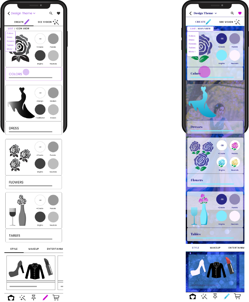
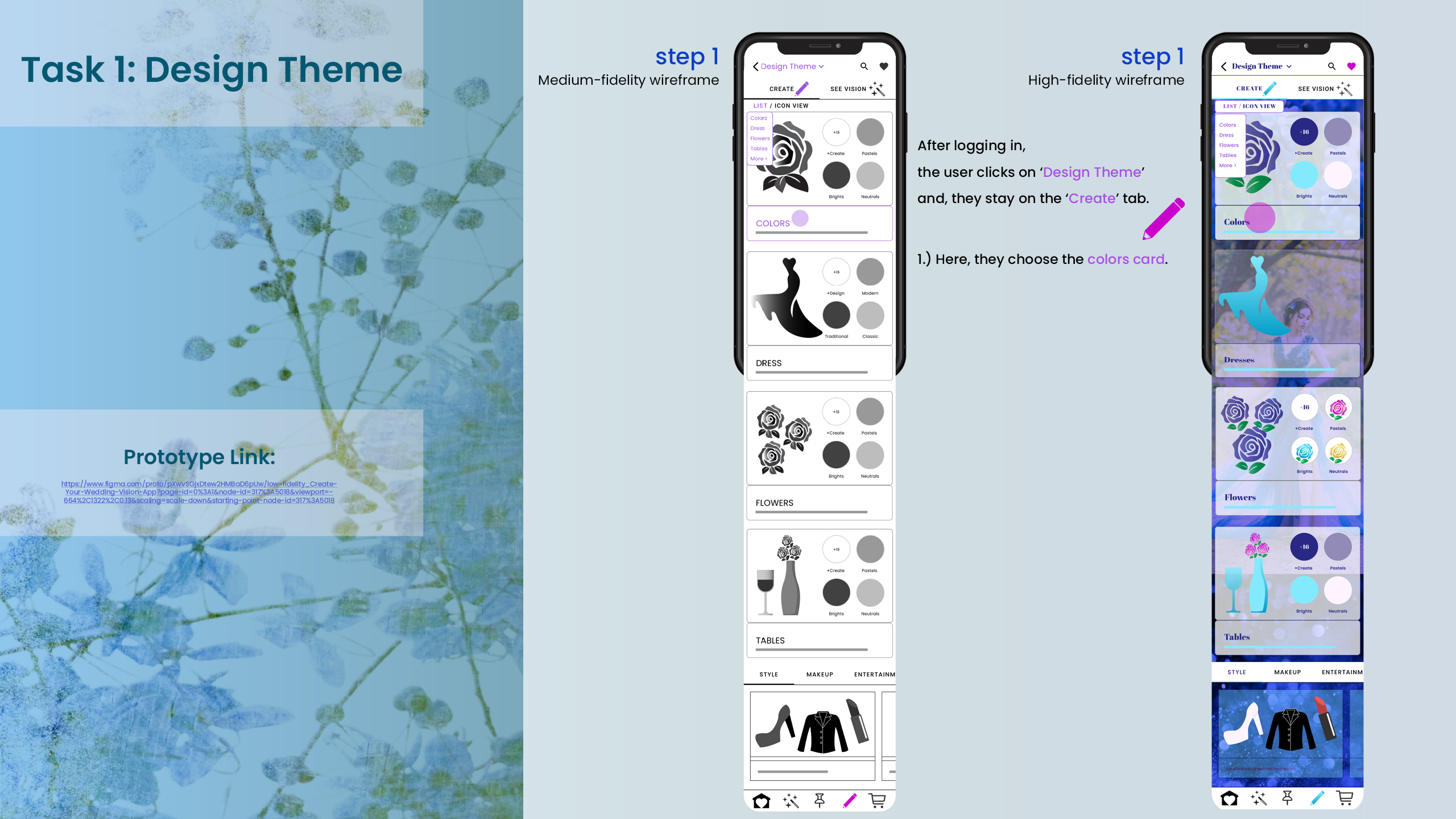
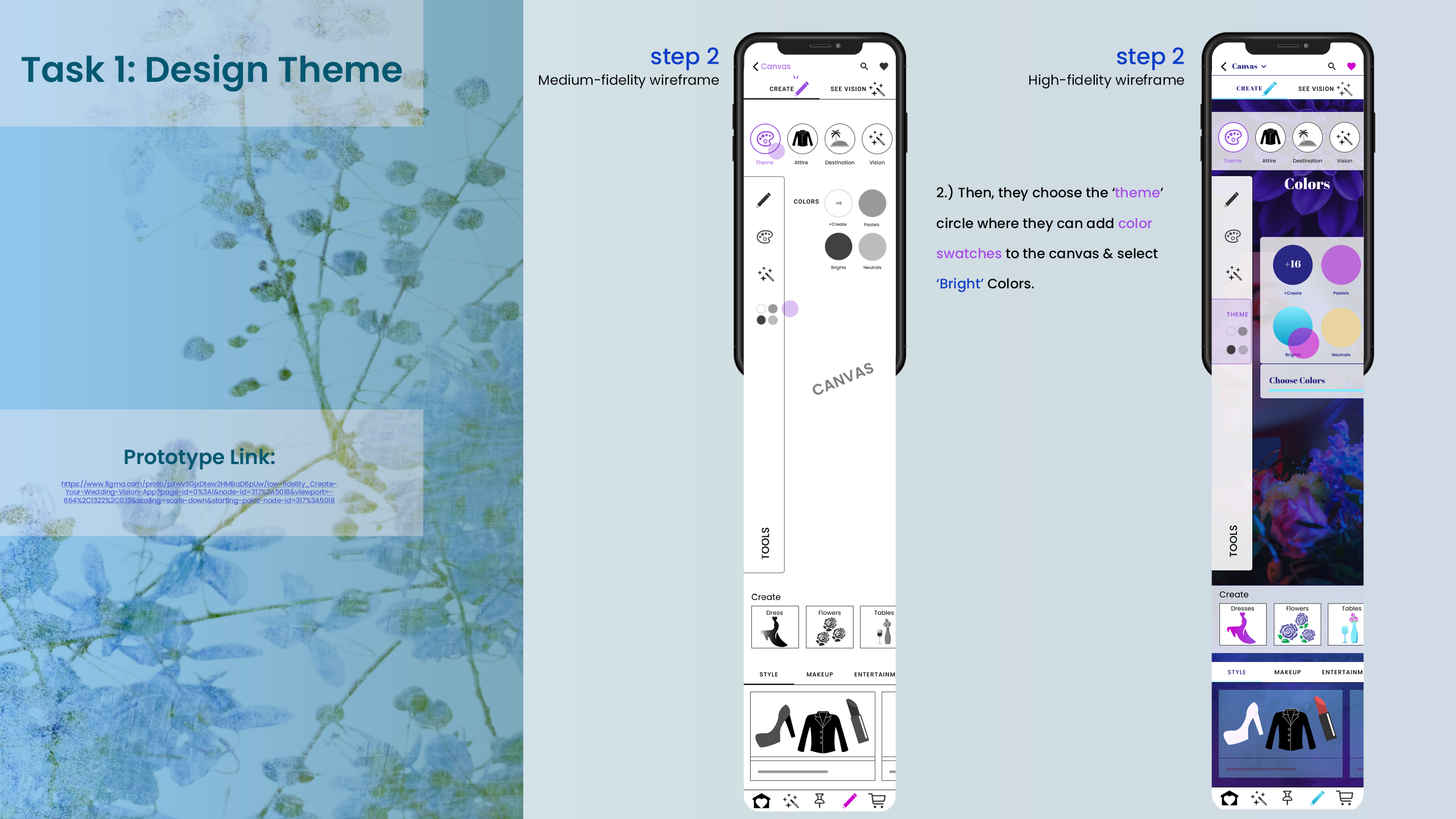
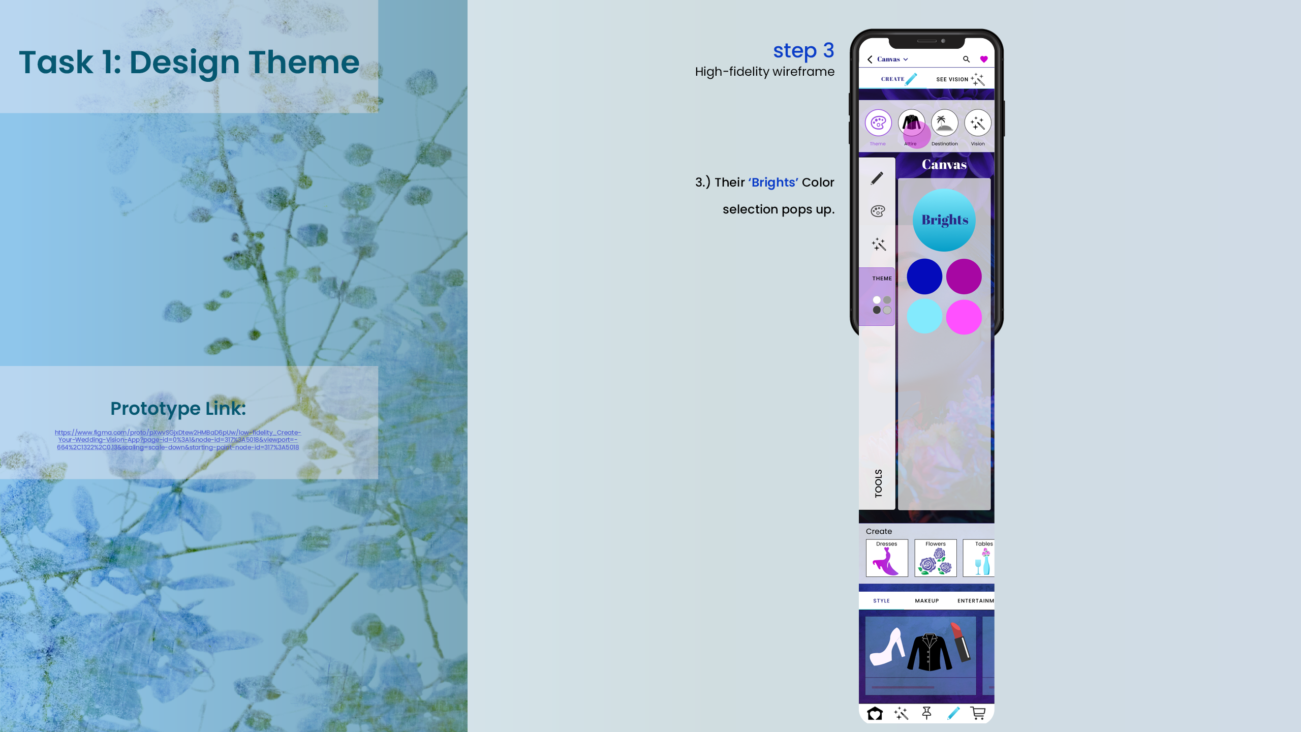
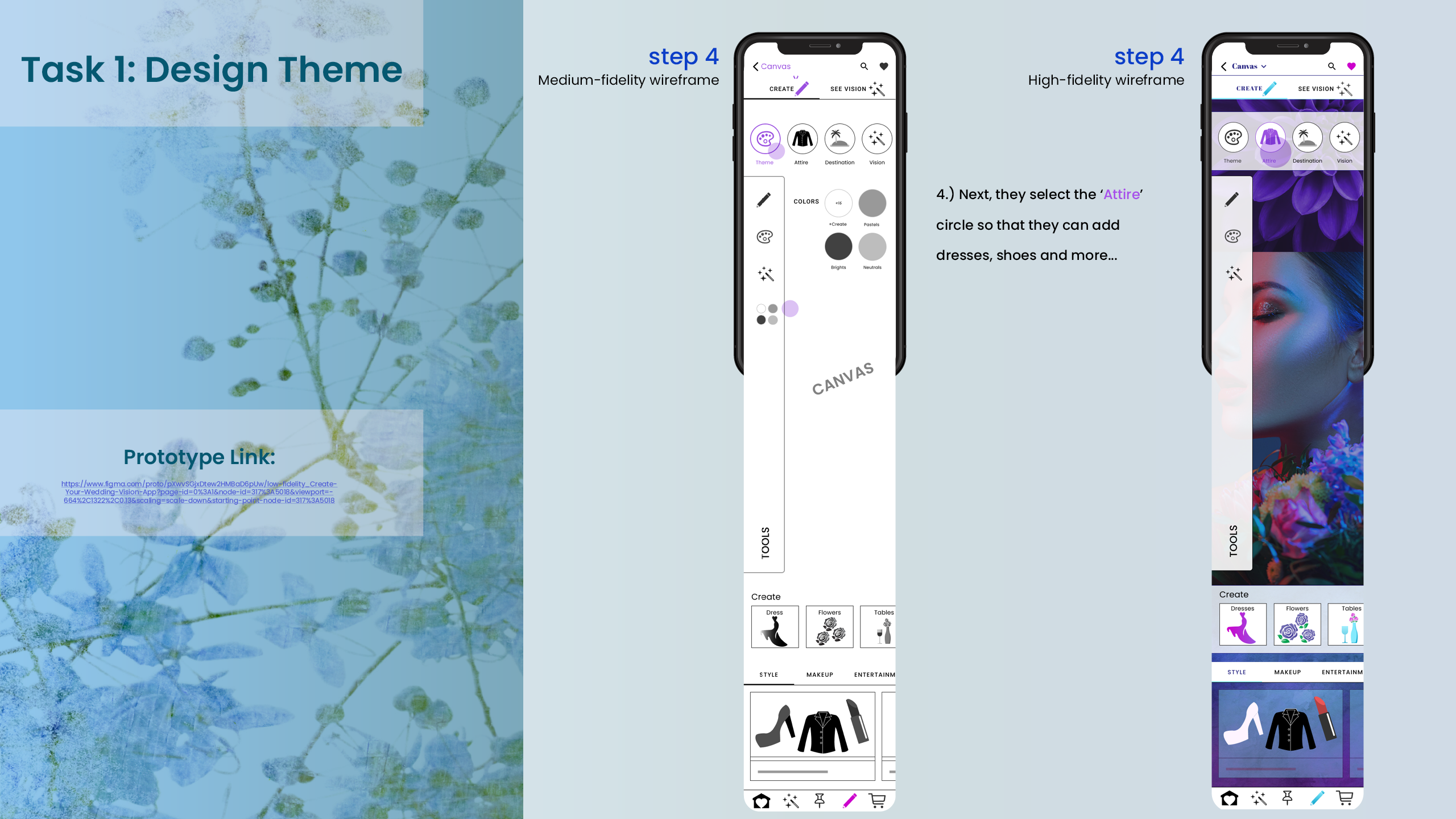
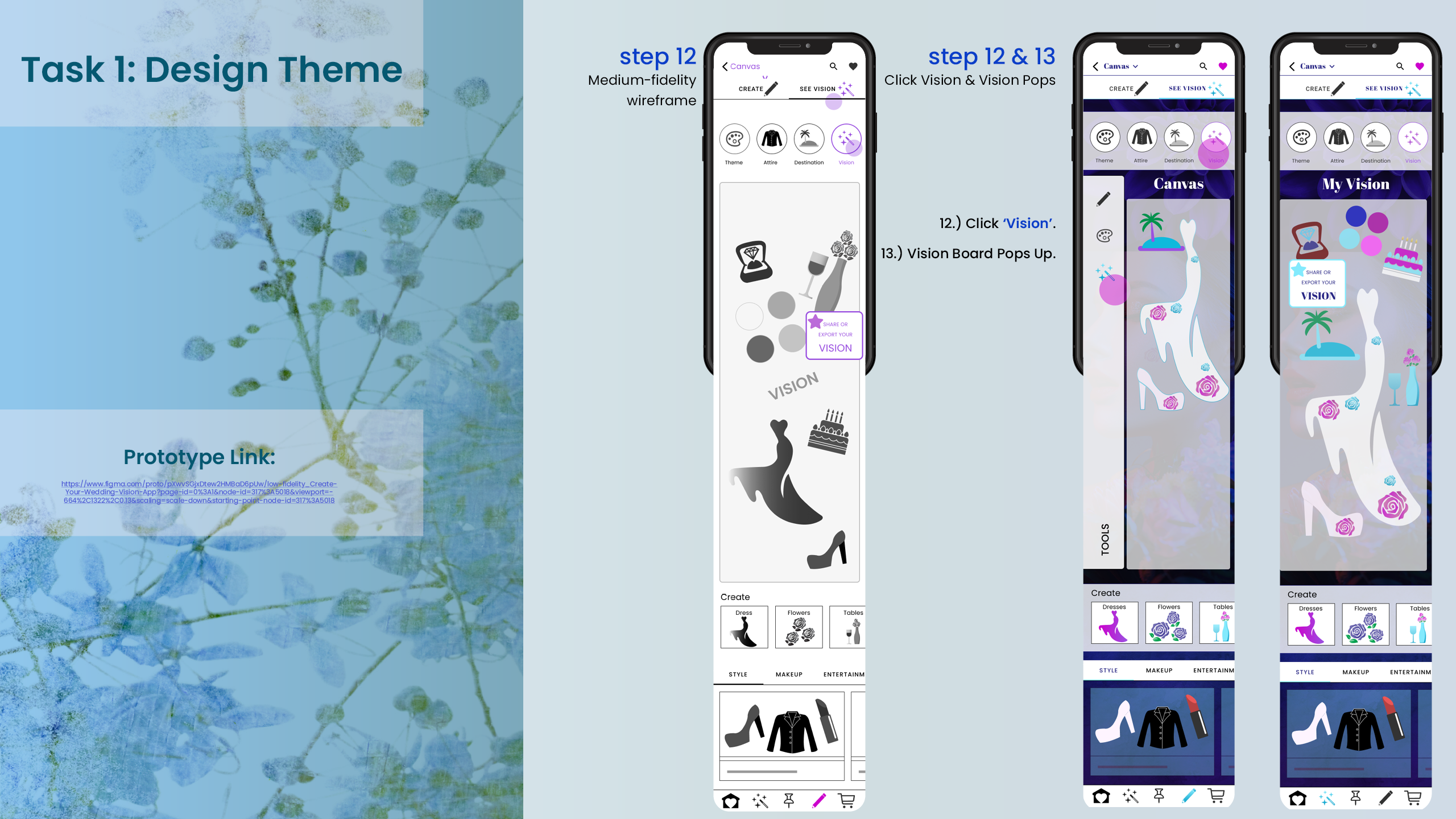
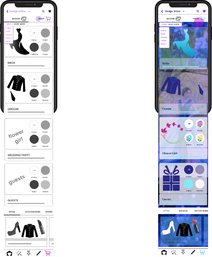
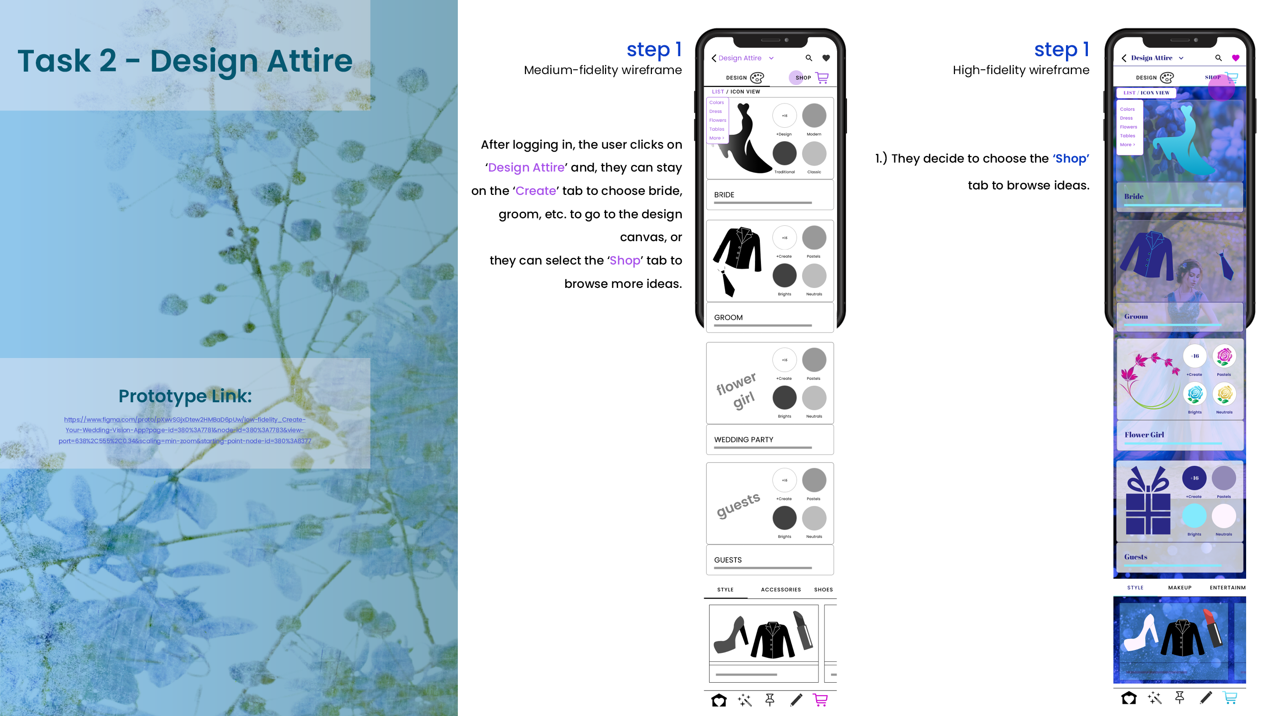
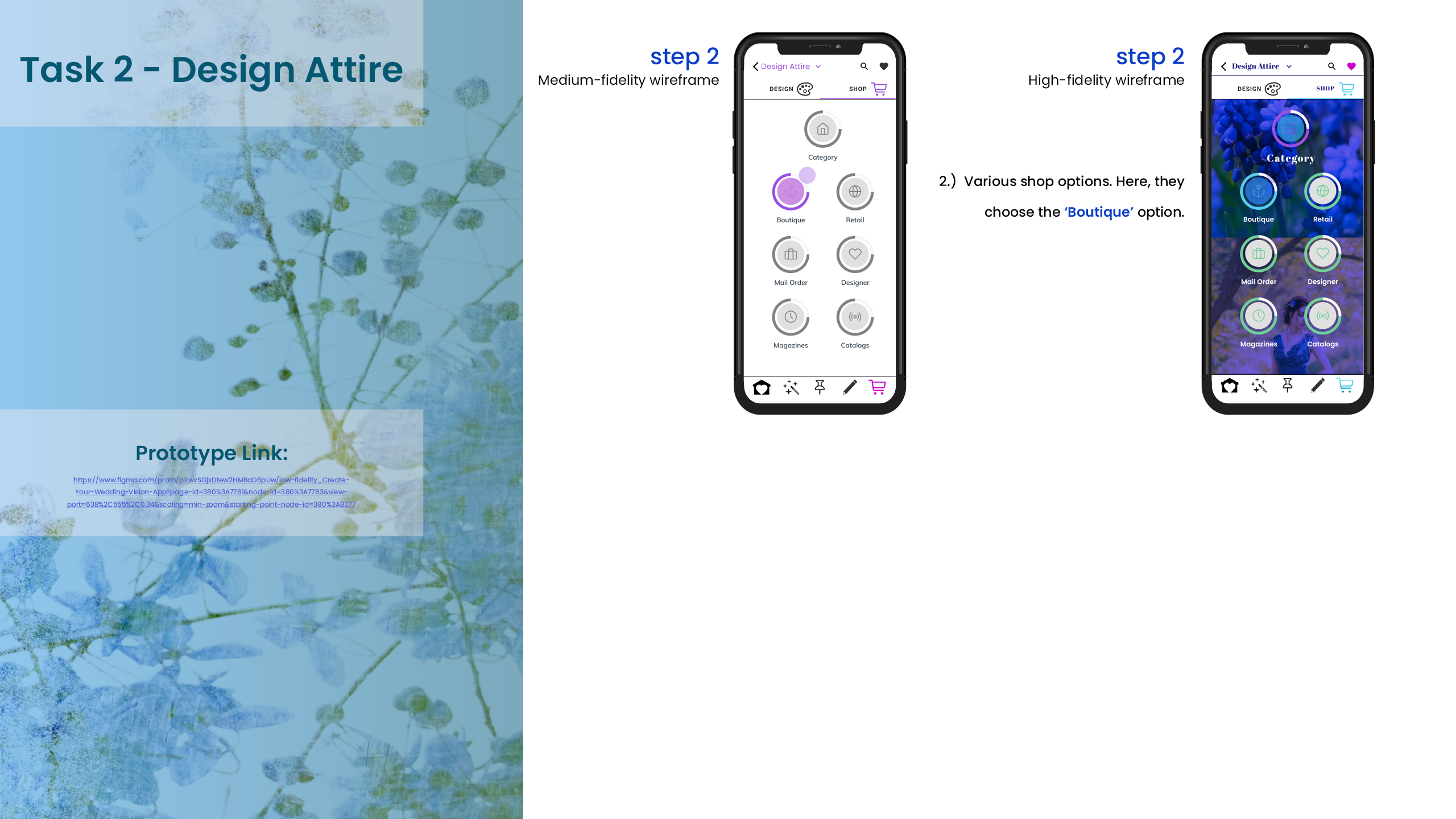
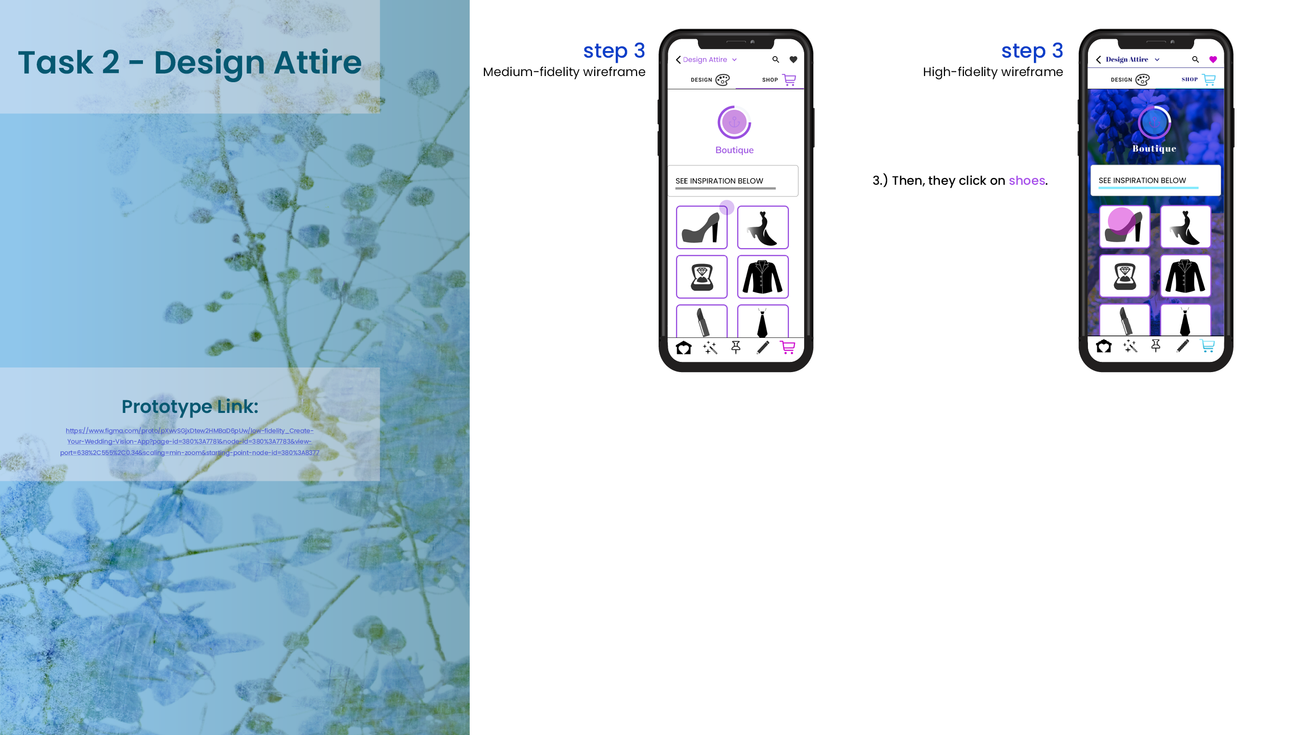
After the User Testing, we have new data to incorporate into the Medium Fidelity Wireframes and Designs. We can start to add colors and to define some of the design elements and further enhance the user flow. We also start to incorporate elements from the moodboard.
10. User Scenario 2
~
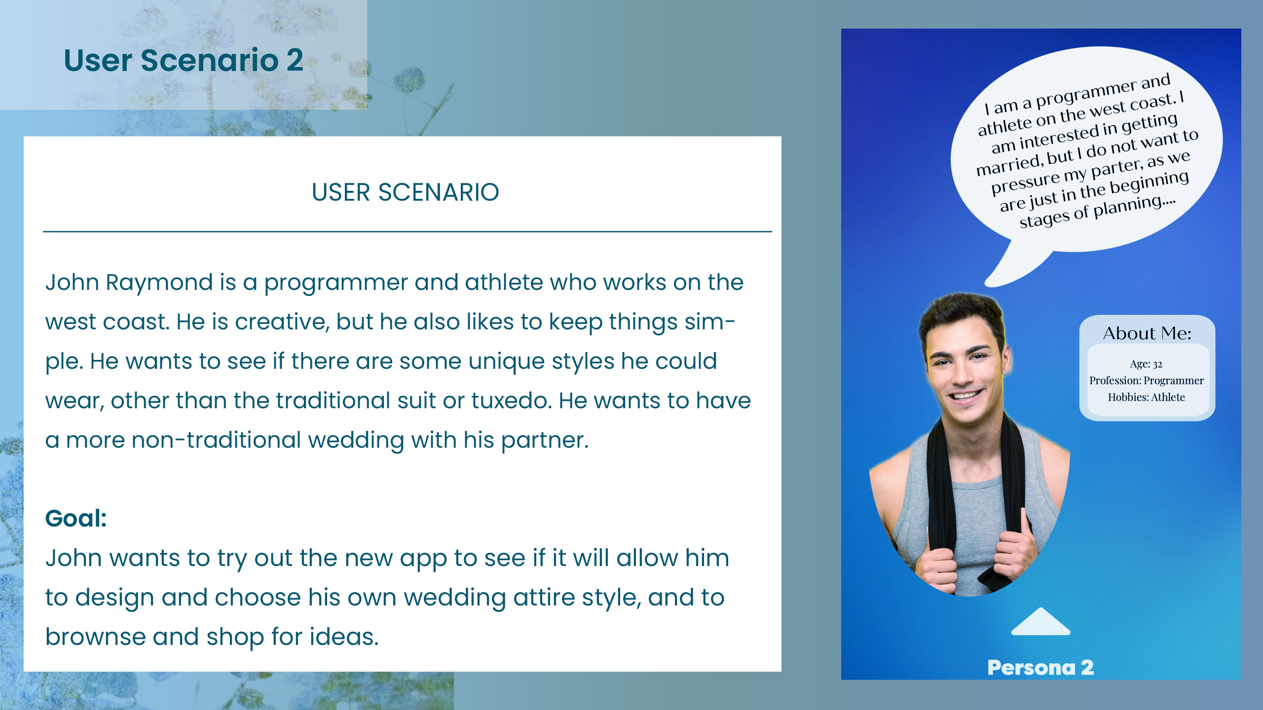
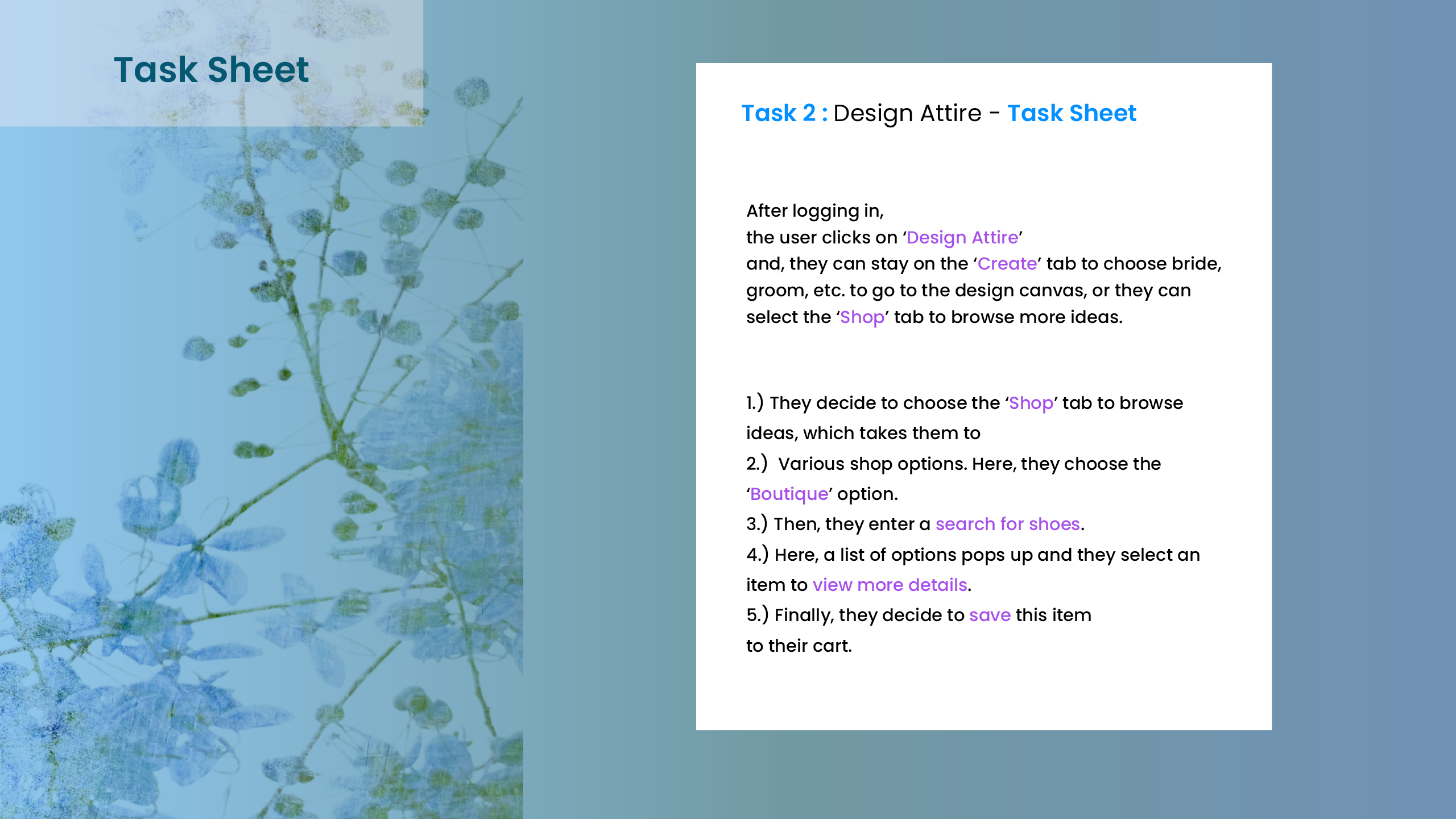
Once the low fidelity wireframes were complete, I was ready to begin testing the userflows and main functionality on the users. We received some helpful feedback for improvements and next steps for the design.
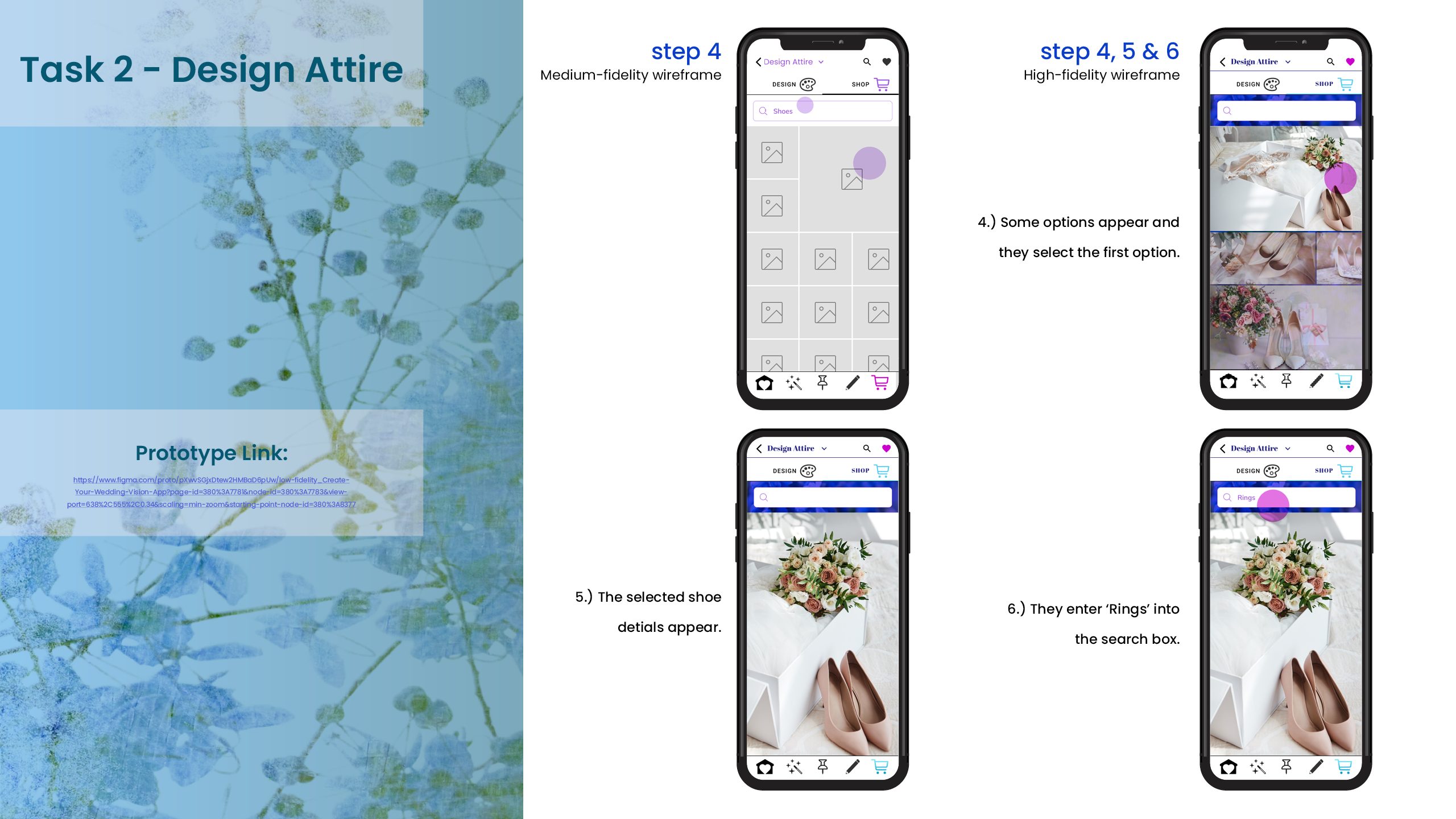
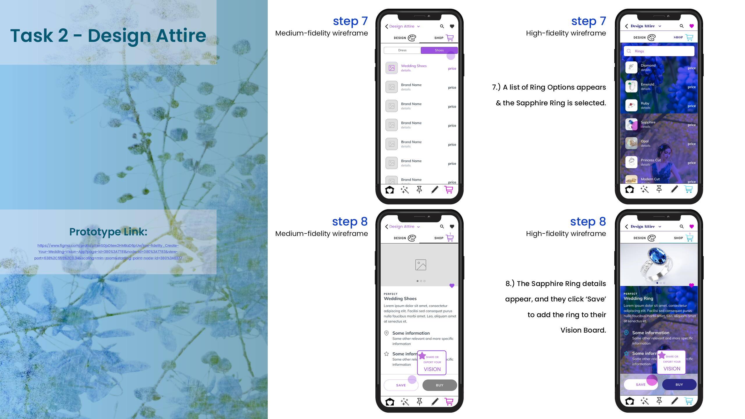
11. Medium & High Fidelity Wireframes
~
After the User Testing, we have new data to incorporate into the Medium Fidelity Wireframes and Designs. We can start to add colors and to define some of the design elements and further enhance the user flow. We also start to incorporate elements from the moodboard.
12. User Scenario 3
~
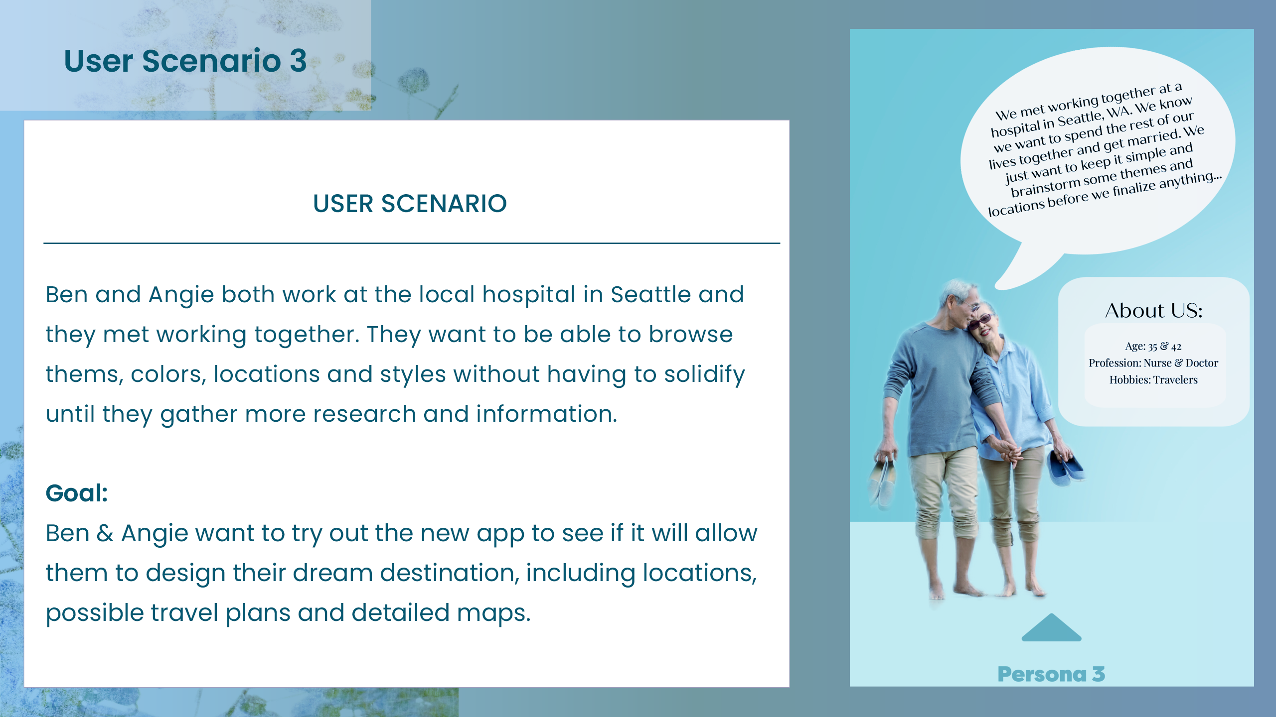
Once the low fidelity wireframes were complete, I was ready to begin testing the userflows and main functionality on the users. We received some helpful feedback for improvements and next steps for the design.
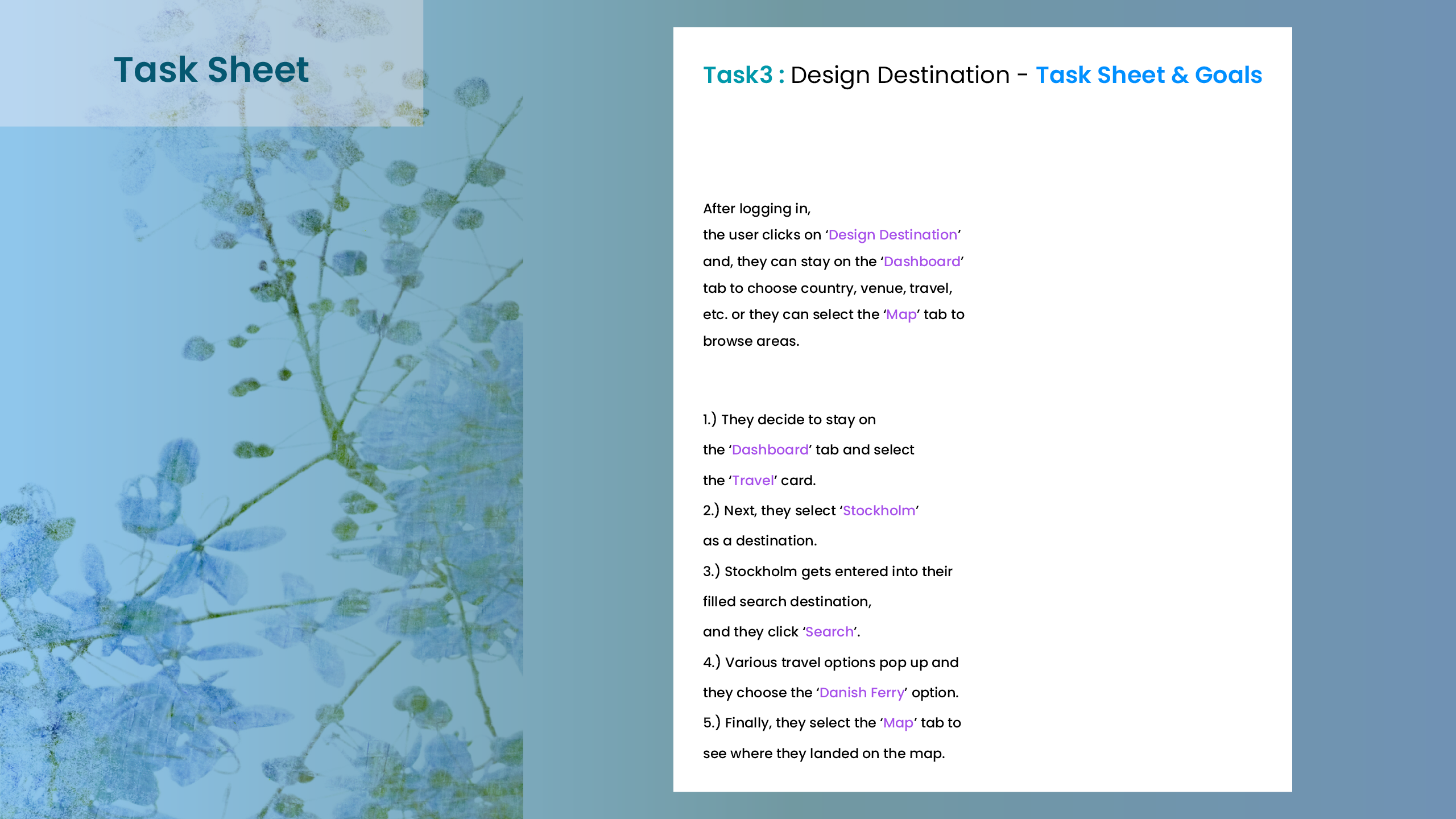
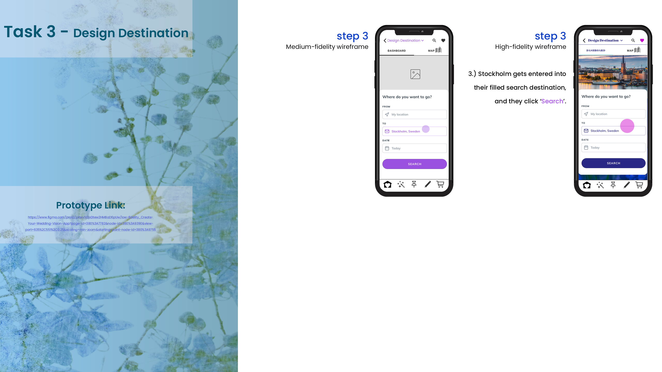
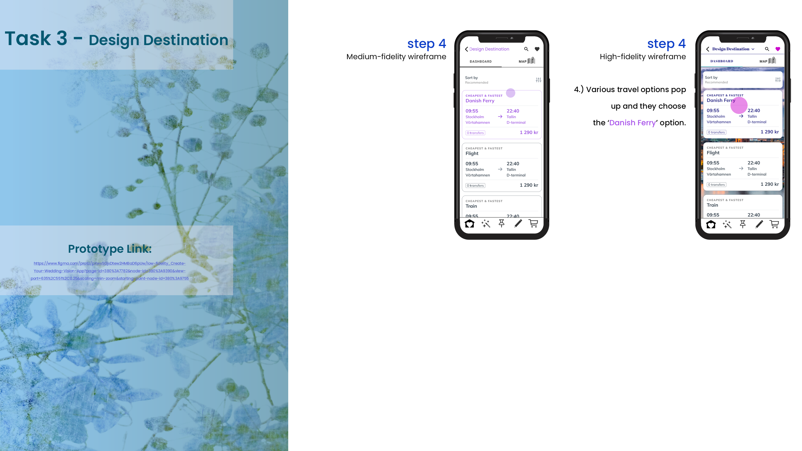
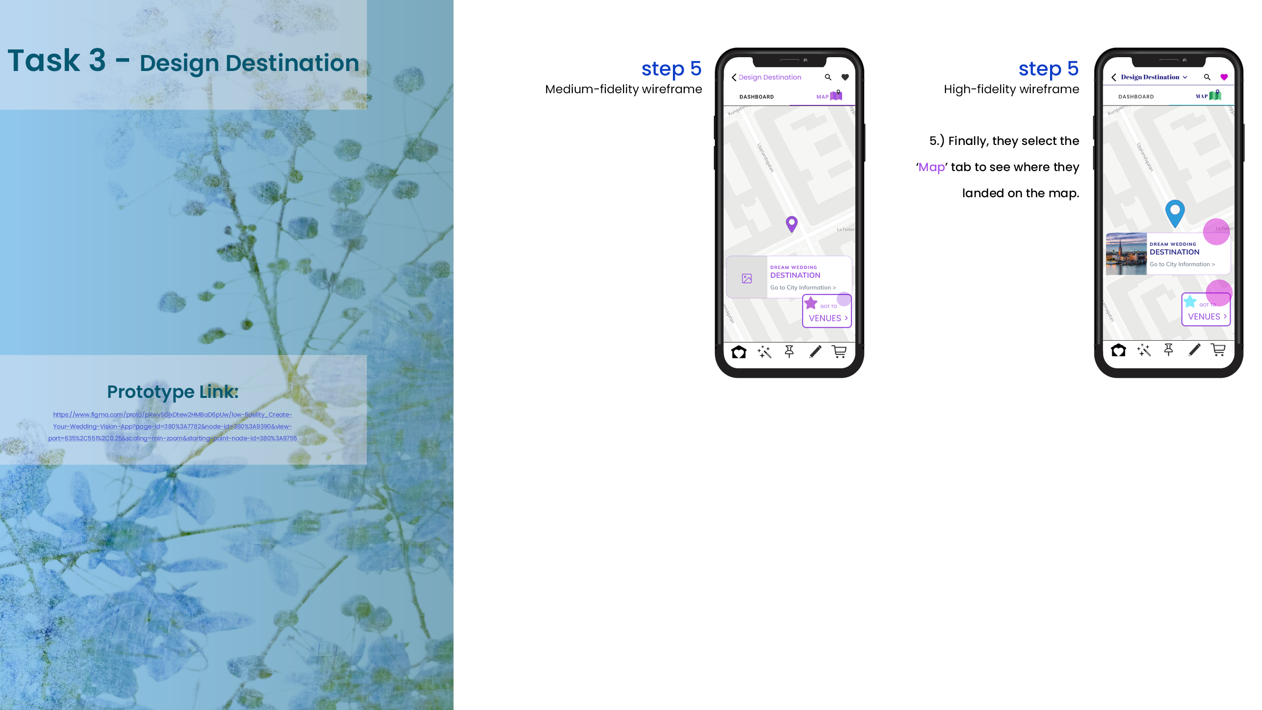
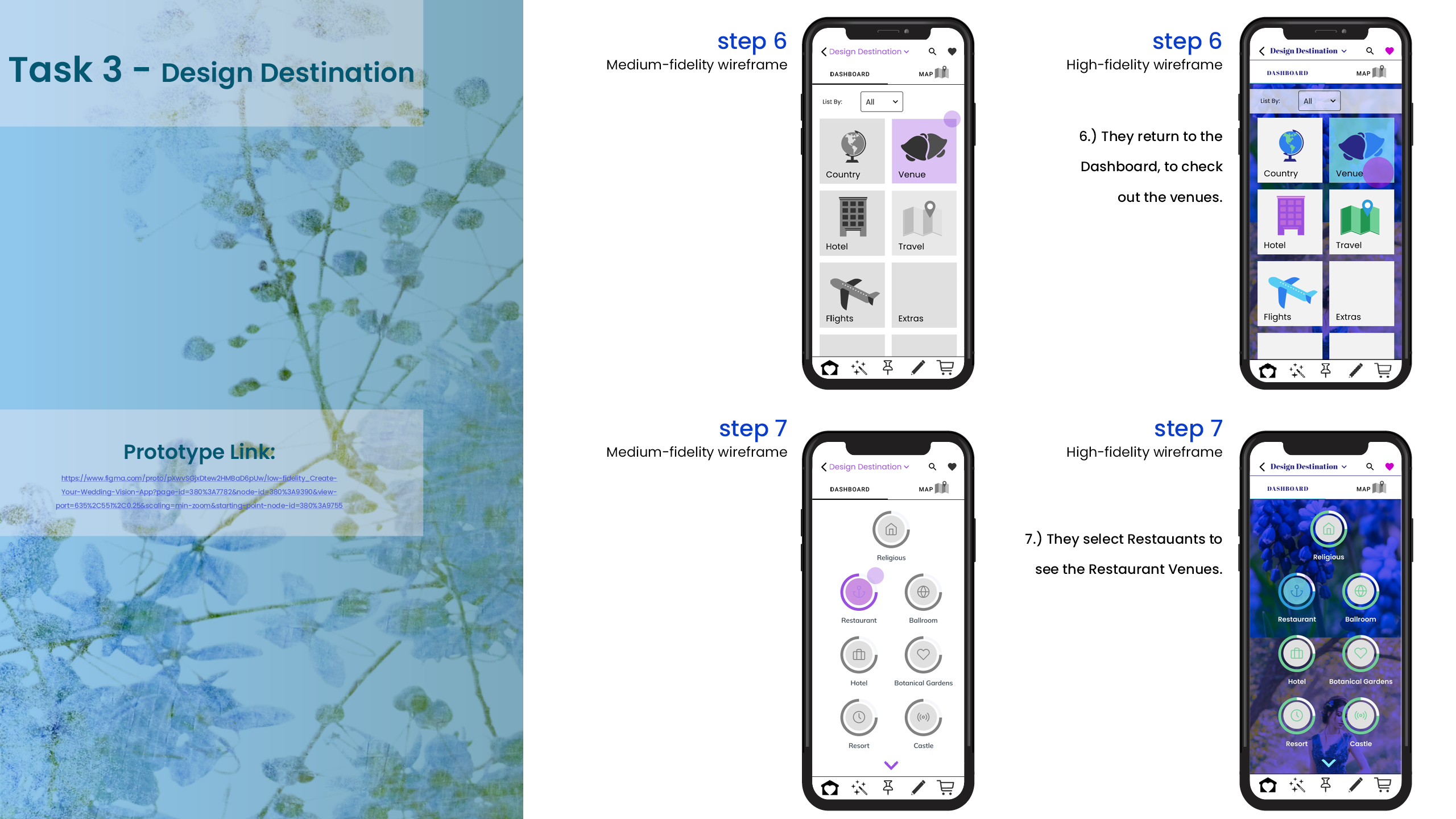
13. Medium & High Fidelity Wireframes
~
After the User Testing, we have new data to incorporate into the Medium Fidelity Wireframes and Designs. We can start to add colors and to define some of the design elements and further enhance the user flow. We also start to incorporate elements from the moodboard.
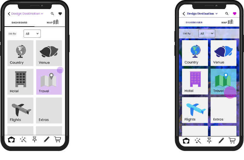
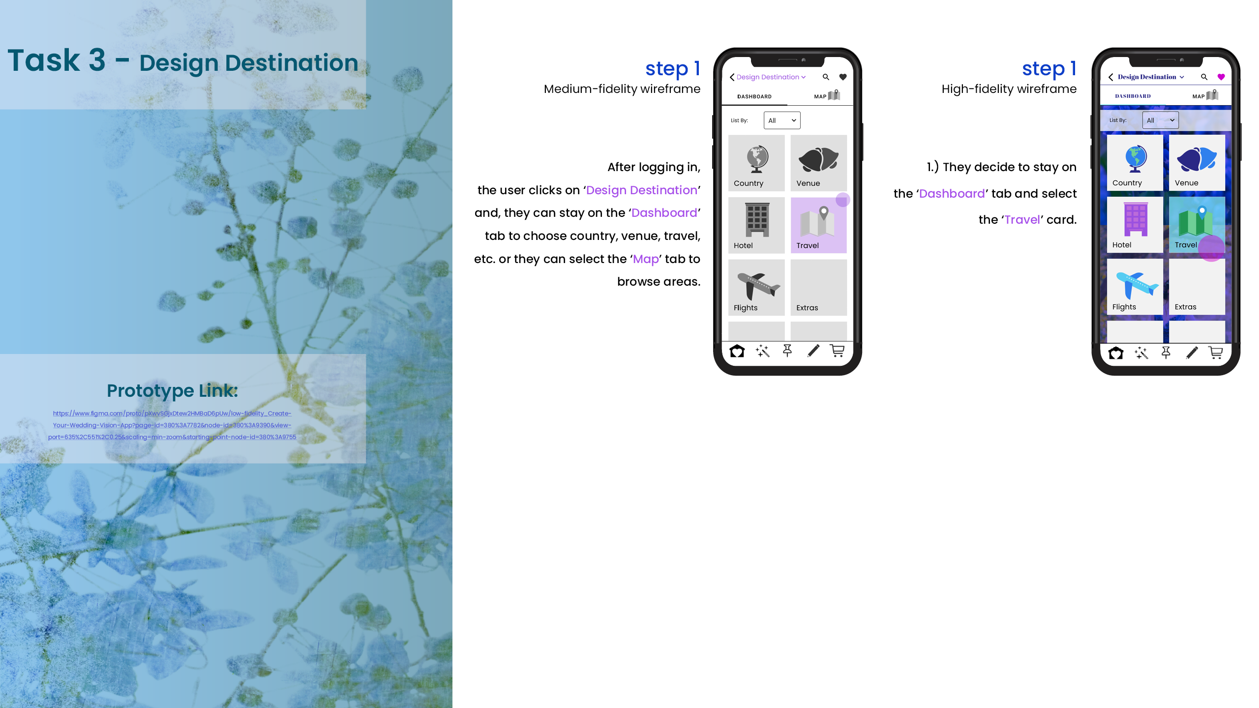
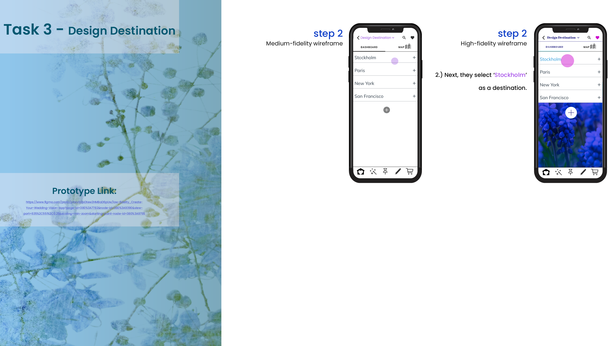
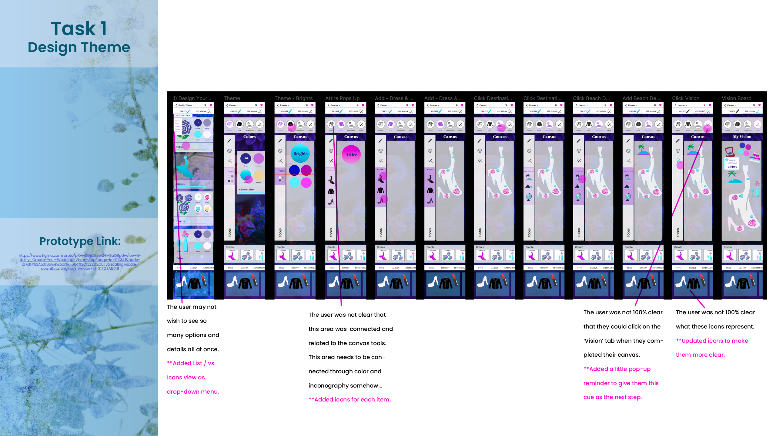
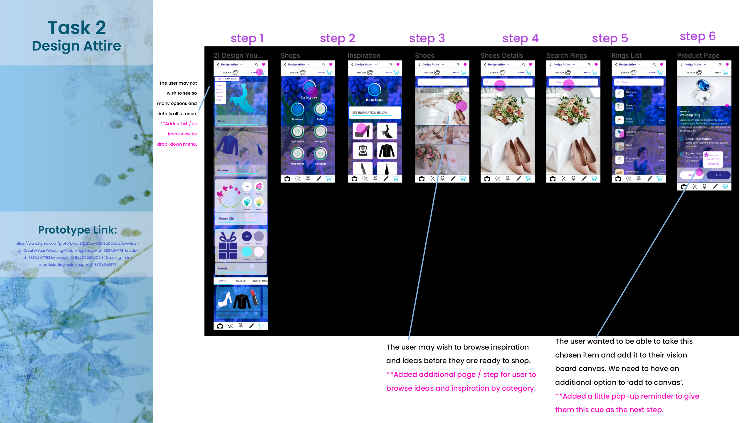
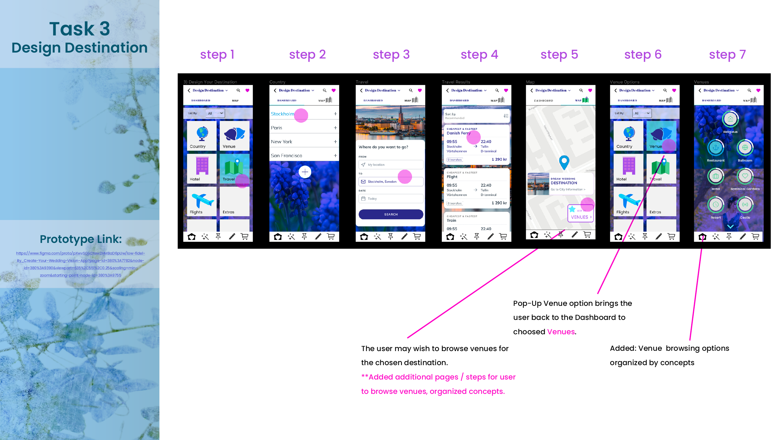
14. Edits & Changes Based on User Feedback
~
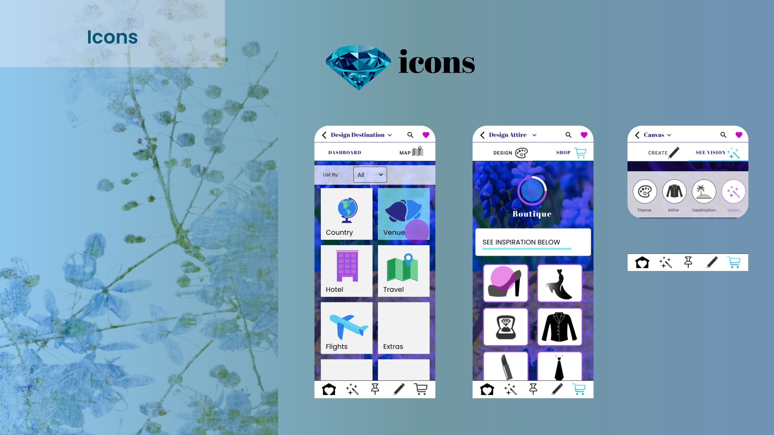
Now we are ready to finalize the wireframes and add the finishing touches, as well as to update the colors, text, icons and moodboard with the enhanced elements.
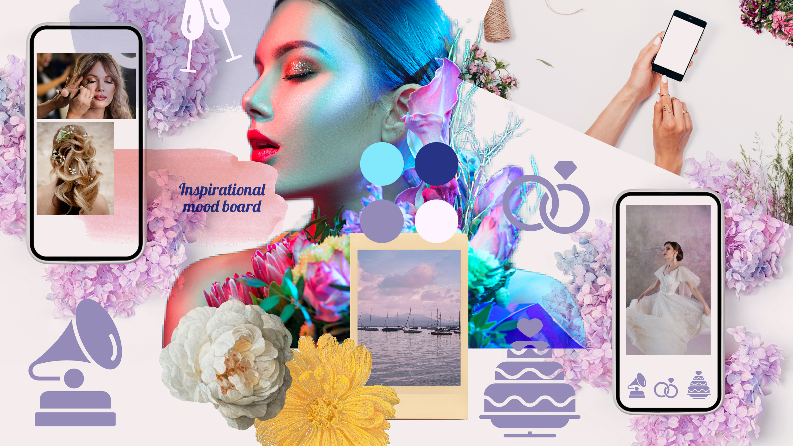
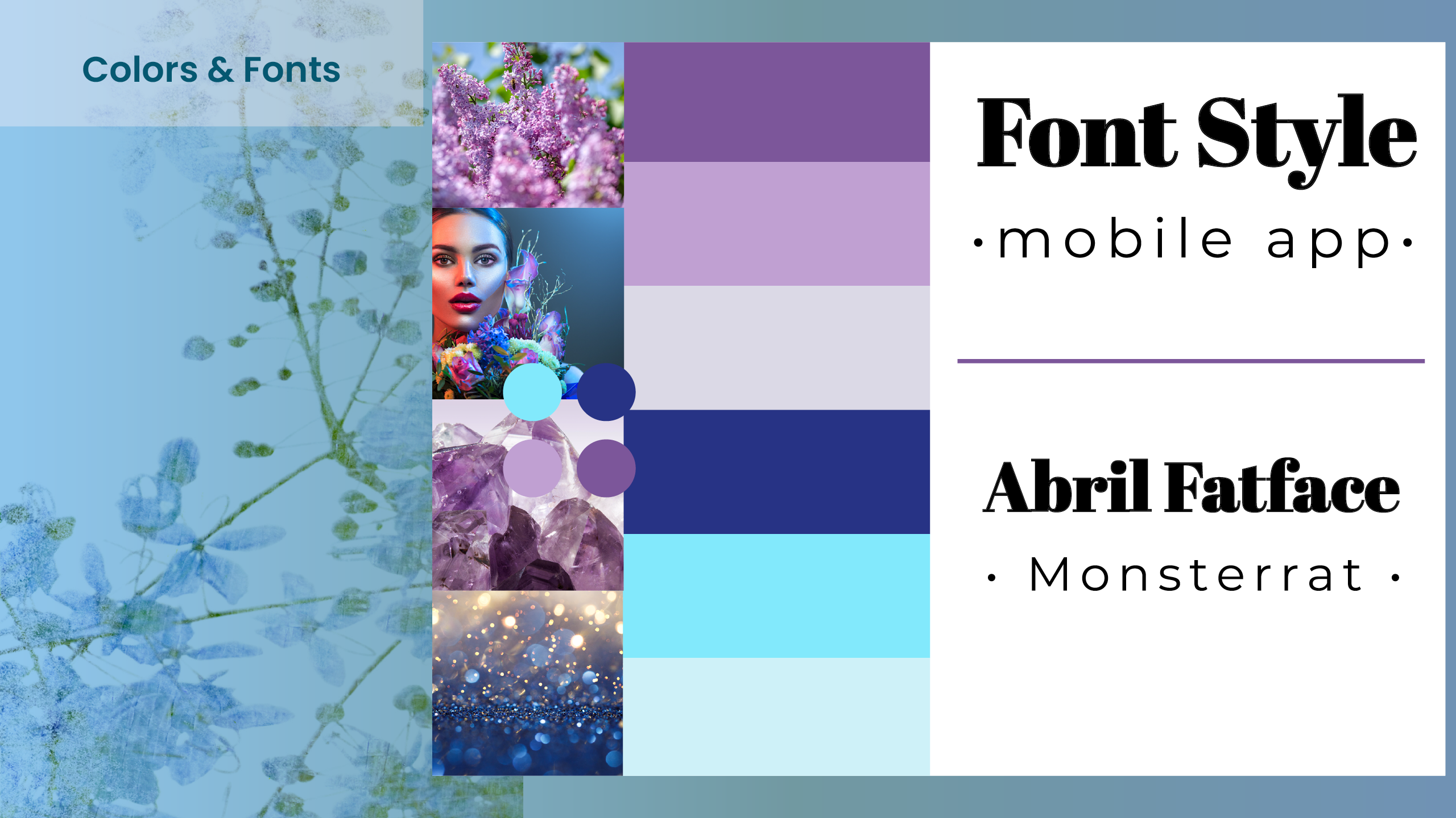
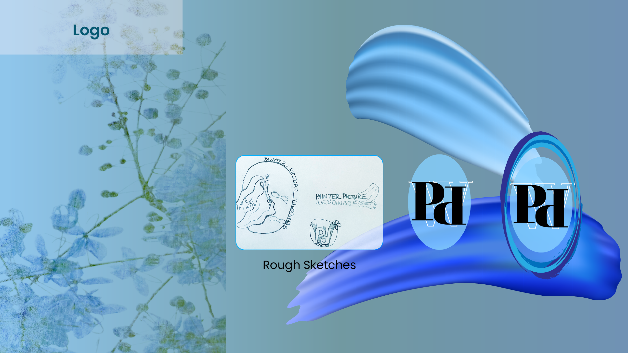
15. Moodboard, Logo, Colors & Fonts
~
Now comes the fun part, adding the finishing touches, as well as updates to the colors, text, icons and moodboard with the enhanced elements.
Conclusion & Scope:
~
I really enjoyed creating the vision of this project and I would love to make this a real app for the public to use in the near future. The process of this project taught me the major points necessary in order to create successful user research, user journey, wireframes, final product design and implementation.
In the near future, I would like to build out the app in live development and also to pull some of the prototypes into videos that I may showcase as embedded videos or animations on this portfolio site.
*At the moment, you are able to view my live prototypes at the links below.
Thank you for viewing my project.